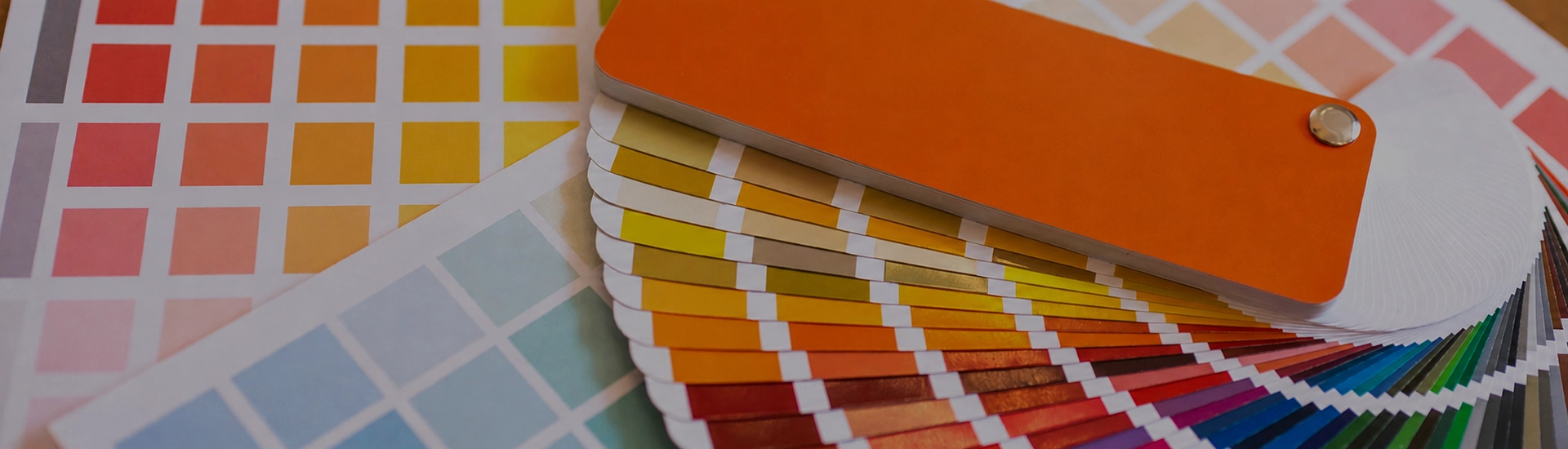

Choosing the right colour palette is key when decorating your home. While finding the perfect wall paint shade can be frustrating, a well-organized colour catalogue makes browsing and selecting from a wide range of shades quick and easy
Violet and purple are not the same colour, but people keep treating them as if they are. Purple leans red. Violet pulls blue. In a room that difference shows up. Violet sits cooler, quieter, less obviously dramatic. Indian home interiors have underused it for years. The range goes from the palest lavender through to deep eggplant, and most homes have at least one room that would respond well to something in that family.
Lavender Haze, Lilac Snow, Grape Mist, and Pearl Lilac from JK Maxx are the shades most people think of first when they hear violet. Pale, airy, slightly sweet. In a bedroom or bathroom, these create a quality of light that’s different from white or grey. Warmer than white, less heavy than any other option at this lightness level. Lavender Haze in a bedroom in the morning has a quality that’s hard to describe and easy to notice.
The practical thing to know: light violets with blue undertones can read slightly cold in rooms that don’t get warm natural light. Grape Mist or Pearl Lilac, the slightly warmer options in this range, handle variable lighting better than the sharper, cooler lavenders.
African Violet, Wood Violet, Viola, and Heliotrope sit in the range that’s actually violet rather than lavender or plum. There’s real colour here without the room feeling taken over by it. In a study room or home office, African Violet on one wall creates an environment that’s genuinely calm and slightly unusual. Not the neutrality of grey, not the energy of blue. In a living room, Viola on the feature wall behind the sofa with white on the other three sides. People walk in and ask what the colour is.
Eggplant Delight, Imperial Purple, Mystic Purple, and Plum Pie are the deep end. These absorb light. The room goes intimate and enclosed. In a room with good natural light and a high ceiling, Eggplant Delight on all four walls of a dining room is genuinely dramatic. In a compact flat with low ceilings, you’re going to regret it. Check the room at different times of day before committing to anything in this category.
Platinum Lilac, Delicacy, Serendippity, and Sonata are greyed-down violets that read as sophisticated neutrals in most lights rather than obviously violet. Somewhere between plain grey and a decision. In a hallway or bedroom where you want warmth but aren’t ready to commit to colour, Platinum Lilac or Delicacy give you something to look at without the room feeling like it’s making a point. They also outlast trend cycles better than more saturated shades.
White with a violet feature wall is the most controlled version of this colour in a room. One wall in African Violet or Viola with white on the other three keeps the colour as the point rather than the whole experience. Match temperatures. Lavender Haze with a warm off-white can look slightly pink. The same shade with a clean cool white looks fresh and intentional.
A warm mid-grey with a dusty or mid-tone violet is a genuinely contemporary combination. Platinum Lilac or Grape Mist on one wall with warm greige on the other three creates a bedroom or living room that photographs well and also actually looks good in person. The grey keeps the violet from feeling too sweet. The violet stops the grey from looking like nothing happened. This combination is also forgiving with furniture. Warm wood tones, lighter upholstery, brass or chrome fittings all work.
Violet and sage or olive green is a combination that’s harder to find in interior design references and genuinely interesting in practice. The two colours sit far apart on the spectrum. The contrast is strong but it doesn’t fight. Lilac Snow or Grape Mist with sage green in curtains or cushions lands as something most people haven’t seen before, which is its own kind of appeal. This works particularly well in rooms that get morning light, where both colours behave well.
Light violet is genuinely one of the better choices for bedrooms. Lavender Haze or Pearl Lilac on all four walls creates an environment that helps with the shift from the active part of the day to the restful part. Not in a mystical sense. Just in terms of how the brain responds to colour temperature. Cool, muted violet signals rest more effectively than warm or saturated colours. Keep the lighting warm in the evening and the combination works.
For adult bedrooms where you want something more substantial, mid-tone violet like Wood Violet or African Violet on the wall behind the bed, with warm neutrals on the other three sides. The violet wall anchors the room without consuming it.
One mid-tone violet wall in a living room, Viola or Heliotrope behind the sofa, with white or light grey on the other three walls creates a room with a specific personality. A violet living room usually reads as a room that belongs to someone specific, rather than something that came with the flat. The practical requirement is light. A violet feature wall in a living room that gets good natural light looks intentional and atmospheric. The same wall in a dim room with limited natural light just looks dark.
Violet is genuinely useful in a study. Warmer colours stimulate. Violet doesn’t, which is useful in a work space. Mid-tone options like African Violet or Purple Aster keep the room focussed without the starkness of white or the flatness of beige. One wall is usually enough. Four walls in a mid-tone violet can start to feel heavy in a room where you’re trying to concentrate.
Grape Ice or Lavender Haze in a bathroom with white fittings and chrome taps is underused and genuinely good. Fresh without the clinical quality of pure white. In a bathroom without natural light, stick to the lightest options. Eggplant Delight in a windowless bathroom is a bad idea.
Light violet and bedrooms get along well. Lavender Haze, Pearl Lilac, and Grape Mist create the kind of room that’s easy to sleep in and easy to wake up in. Mid-tone violets like African Violet work better as a single wall behind the headboard than all four walls. The darker, more saturated options need space and good light to work in a bedroom. In a compact room they’ll close things in.
White or cool off-white for the simplest and cleanest version. Warm grey for a contemporary combination that ages well. Gold and brass for richness, particularly with deeper violets. Sage green as an unexpected but effective complementary pairing. Avoid bright orange or full-strength red alongside violet. The room ends up fighting itself.
Light violets like Lavender Haze and Pearl Lilac work in small rooms in a similar way to light blues and muted greens. They don’t make the room feel larger but they won’t close it in either. The pale, slightly cool quality of light violet keeps the room feeling open. The darker plums and eggplant violets absorb light. In a small room that means the space feels tighter after painting than it did before.

