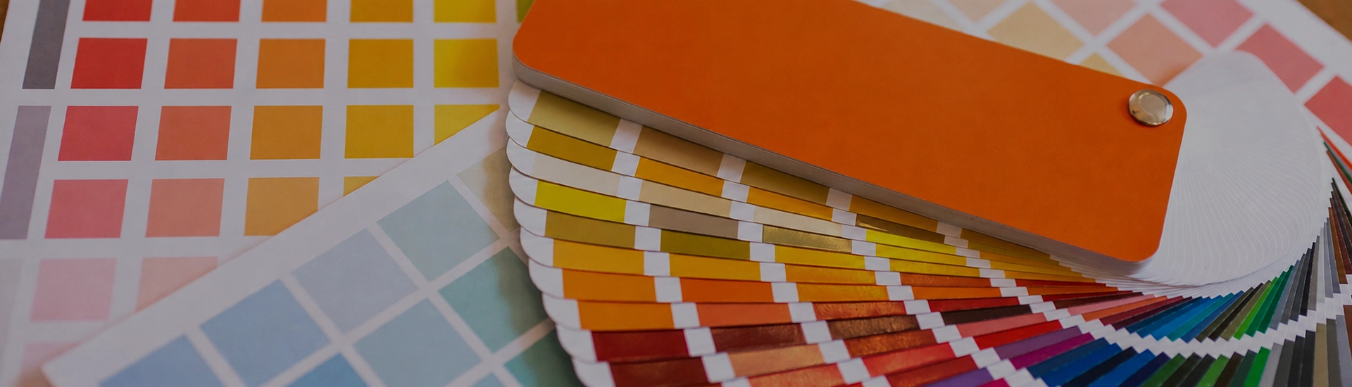

Choosing the right colour palette is key when decorating your home. While finding the perfect wall paint shade can be frustrating, a well-organized colour catalogue makes browsing and selecting from a wide range of shades quick and easy
Ask someone to describe lilac and watch them hesitate. It has pink in it and it has purple in it and depending on the light it can read as either on the same day. That’s not a flaw. A lilac color wall in morning light looks quite different by evening, and that shift gives the room a quality you don’t get from a colour that just sits there.
The other thing worth knowing upfront: lilac is not the same as lavender. Both are soft purples, but lilac has more pink in it. Lavender pulls more blue. A lilac lavender room color sounds similar but feels noticeably different. Lilac runs warmer and feels more romantic, while lavender runs cooler and calmer.
Lavender Haze, Lilac Snow, and Pearl Lilac from JK Maxx are so light they read as a warm white in photographs and only reveal their colour in person. A pale lilac paint color in this range suits rooms where the wall should stay out of the way. Hallways, nurseries, bathrooms, small bedrooms. The colour is there, but it’s not trying.
North-facing rooms with flat indirect light all day are where pale lilac earns its place. It holds up in those conditions better than cool grey or stark white.
Platinum Lilac, Delicacy, and Serendippity are the shades most people land on when they’ve thought about it for a while. Soft lilac paint color in this range has enough colour to register as something — not enough to commit the room to a specific personality. In a bedroom, Platinum Lilac on all four walls has a quality of rest that’s genuinely hard to achieve with grey or off-white. In a living room, Serendippity on the main wall, warm neutrals on the other three. People notice and ask about it.
The grey in the base of these shades is what makes them liveable. It takes the sweetness out and leaves something more complex.
Lady Diana, Sonata, and Olympia are properly lilac. More colour in the base, less grey. A lilac color for bedroom walls in this range creates a room with a specific character. These shades read warmer in the morning and pull slightly more blue-purple by evening. In a bedroom that gets good morning light, Sonata on all four walls is worth trying. In a north-facing room without direct sun, test first. Mid-tone lilac can go slightly flat in those conditions.
The simplest version. A lilac wall paint with white skirting, white ceiling, and white on the other three sides. Temperature matching matters here the same as it does with any purple-adjacent colour. A pink-leaning lilac like Pearl Lilac needs a warm off-white rather than a stark cool white. A cooler lilac like Lavender Haze handles a crisp cool white better. Get the temperatures wrong and both colours look slightly wrong in a way that takes a while to identify.
A warm mid-grey on three walls with a soft lilac on the fourth. The grey keeps the lilac from feeling sweet. The lilac stops the grey going flat. Nobody who walks in calls it a lilac room. It just looks good. Works well in bedrooms and living rooms where you want the colour to register without dominating.
Lilac and sage green have no obvious connection, and the room doesn’t feel like it’s explaining itself. The contrast is real. Neither colour is trying to win. Pearl Lilac on the walls with sage green curtains, cane furniture, and jute textiles. The room looks like it belongs to someone. Good for rooms that get morning light. Both colours respond well to it.
Soft lilac next to gold and brass is a combination with genuine warmth. The warm undertones in the lilac and the warmth of the brass find each other. The brass stops being background hardware and becomes part of the room. Sonata or Lady Diana on the walls with brass lamps and warm-toned wood furniture creates a room that feels rich without going theatrical.
Bedrooms are the natural home for lilac color for bedroom walls. The soft, slightly pink-purple quality is restful in a way that grey can’t quite match and white doesn’t attempt. Pale and soft lilac shades — Lavender Haze, Platinum Lilac, Delicacy — work on all four walls. Mid-tone shades like Sonata work better as a single feature wall behind the headboard with neutrals on the other three sides. Keep evening lighting warm. Cool white LEDs pull the colour towards grey and the room loses whatever quality made lilac the right choice.
Serendippity or Pearl Lilac on all four walls of a living room with warm wood furniture, brass accents, and light-coloured upholstery. The room reads as belonging to someone who made an actual decision. The room feels considered without the colour being the first thing you notice. For more impact, one mid-tone lilac wall with white or warm grey on the other three creates a focal point that reads as deliberate.
Pale and mid-tone lilac shades are genuinely good for children’s rooms. Lilac Snow or Pearl Lilac on the walls with white furniture, bright accessories, and natural light creates a space that’s lively without being chaotic. Lilac doesn’t have the age-specific associations that primary colours carry. Paint it in a nursery and it’s still appropriate when the child is eight.
Lilac has more pink in it. Lavender has more blue. The difference is visible when you hold them together. Lilac runs warmer. Lavender runs cooler. In a bedroom, both work, but the mood is different. Lilac makes the room feel like someone lives there. Lavender makes it feel like somewhere to leave the day at the door.
Lavender Haze and Lilac Snow handle low-light rooms without going flat. Enough pale colour in the walls and the space stays airy. Mid-tone and deeper lilacs are harder to manage in dim rooms. In a dim room, mid-tone lilac flattens by midday and the colour you chose stops being visible. Keep to the lightest end if natural light is the issue.
White is the most reliable partner. Warm grey for a contemporary, understated combination. Sage green for an unusual but genuinely effective complementary pairing. Gold and brass for warmth and richness. Avoid cool blues or stark charcoal alongside lilac. Both combinations pull the colour in directions that look unresolved.

