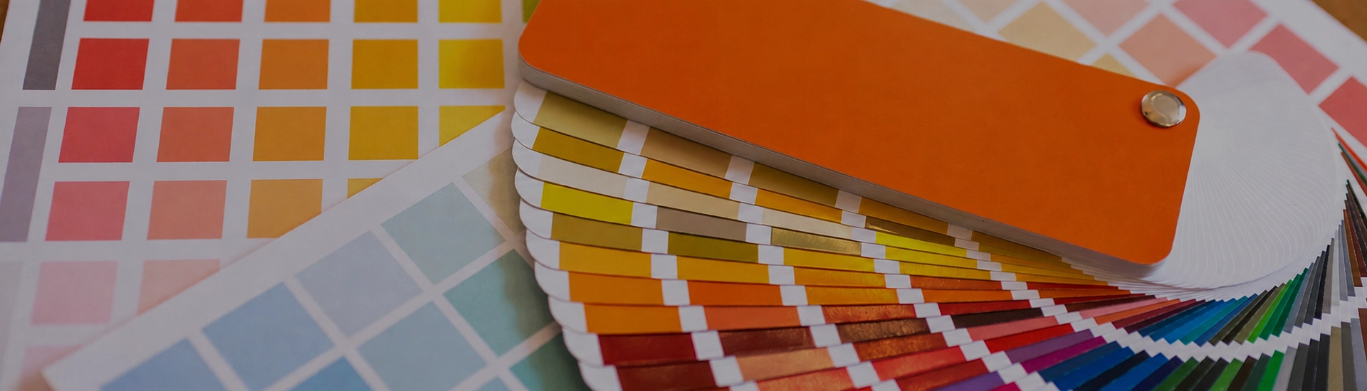

Choosing the right colour palette is key when decorating your home. While finding the perfect wall paint shade can be frustrating, a well-organized colour catalogue makes browsing and selecting from a wide range of shades quick and easy
Say the phrase “neutral wall paint” and everyone immediately pictures the same awful thing. You know the one. That blinding, chalky white that landlords roll over literally every surface of a cheap rental flat. Or, somehow worse, that depressing, murky beige from 2004 that just makes a room look permanently dusty.
Let’s kill that myth right now.
Doing neutrals properly is basically the biggest flex in interior design. When you nail it, neutral interior paint colors don’t look boring. They just look expensive. A good neutral gives your brain a break. It lets your overpriced sofa and art do the heavy lifting. But mess it up? That’s how your living room ends up feeling like a dentist’s waiting area.
Here is the unfiltered truth about finding the right neutral colors for walls, without losing your mind in the paint aisle.
Every single neutral paint has a hidden agenda. We call it an undertone, and honestly, it will ruin your life if you ignore it.
You think you’re grabbing a standard, simple grey? Nope. Slap it on the drywall and suddenly, depending on the time of day, it’s flashing baby blue. Or lavender. Or a slightly nauseating green. You think you bought plain cream? By 4 PM, your hallway looks like the inside of a butter tub.
This right here is why picking neutral room colors makes people want to pull their hair out. You aren’t just picking grey or beige. You’re picking a color that’s pretending to be grey or beige. To avoid a very expensive mistake, you absolutely have to figure out what color family your neutral is secretly hiding.
For the last decade, the whole world was in a chokehold by cool, icy greys. Thank god that era is officially over. Everything is shifting back to warm neutral paint colors, and it’s about time.
A stark, chilly grey is just depressing unless your flat has massive floor-to-ceiling windows. You need warmth. That means grabbing a biscuit, a mushroom, or a really soft taupe. Because they have a tiny bit of red or yellow mixed into the formula, they instantly make a chilly room feel lived-in. And if your house is packed with chunky wooden furniture—like those heavy teak dining tables or dark walnut beds we all seem to have in India—these warmer tones won’t fight with the wood. They actually complement it.
Sometimes a heavy beige feels like too much, but you know stark white is going to look clinical. Enter light neutral colors. I’m talking about alabaster, soft linen, or a really pale ivory.
If your flat is tiny, or your only window stares straight into your neighbor’s brick wall, you need these. They bounce whatever little light you have around the room without giving you a headache. Want a crazy designer trick to fake more space? Paint the walls, the ceiling, and the skirting boards the exact same pale color. You won’t be able to tell where the wall ends and the ceiling begins, which completely tricks your brain into thinking the ceiling is way higher than it actually is.
Your main room works hard. You need a color that looks fresh over your morning tea, but doesn’t feel like a dentist’s waiting room when you’re crashing in front of the TV at night. Honestly, mid-tone greiges are your safest bet here. That weird middle ground between beige and grey—think of a warm oatmeal color—is incredibly forgiving. It shifts with the light instead of looking weird when the sun goes down. They look crisp during the day, and deeply grounded and shadowy at night.
This room shouldn’t stimulate you at all. You want neutral room colors that practically force you to go to sleep. Skip the high-contrast whites. Go for muddy, warm neutrals. Look at dusty clays, deep creams, or a muted taupe. The whole point is to find a shade that looks incredible when the main lights are off and just your bedside lamp is on.
Oh, and finish matters. Buy matte paint for the bedroom. Anything with a gloss is going to catch the light and bounce glare into your eyes. Matte soaks up the light, making the walls feel velvety and quiet.
Kitchens are naturally chaotic rooms. They are packed with really aggressive, cold materials. Between the stone countertops, glass, tile, and big metal appliances, you really need a softer wall color just to calm the whole space down. A warm putty or soft off-white is perfect.
But listen to me: change your finish. Do not use matte paint in a kitchen unless you want a permanent record of every turmeric or oil splash. Get an eggshell or satin finish. You get the same gorgeous neutral tone, but you can actually take a wet sponge to it.
Before you get lost in those massive Asian Paints or Nerolac swatches, remember one thing about living in a hot climate: our sunlight is extremely intense, and it burns very yellow. Put a pure, blinding white in a south-facing room, and you’ll need sunglasses indoors by 3 PM. To counteract that heavy afternoon glare, you actually want to pick a paint with a cooler, chalky grey or ash undertone. It basically acts like visual air conditioning for the room.
But if you have a north-facing room? The light coming in is weak and blue. Put a cool grey in there and it instantly looks like a prison cell. You have to fight that cold light by pumping in very warm neutral paint colors. Bring on the sandy beiges and warm creams to fake a little sunshine.
So you finally picked it. You painted the wall. It looked stunning at lunch. Then the sun sets, you turn on your overhead LEDs, and suddenly your expensive soft taupe is aggressively pink.
Do not blame the paint. Blame your lightbulbs.
Most people use warm-white or yellow LED bulbs. These basically act as a magnifying glass for the red and yellow undertones in your neutral wall paint. If you see a massive, hideous color shift at night, swap your bulbs for a “neutral white” (around 4000K) before you have a meltdown and repaint the whole thing.
The biggest complaint about neutral interior paint colors is that they look flat. But if a neutral room is boring, the paint isn’t the problem—your styling is.
If you strip all the bright colors out of a room, you better bring in some texture, or the room will fall flat. Picture a plain beige wall. Now put a smooth beige sofa in front of it, sitting on a standard beige rug. It looks like a bowl of unflavored oats. Nobody wants to live in that.
Layer it up. Throw a nubby wool blanket over a smooth leather chair. Hang heavy linen curtains against those smooth walls. Mix up your metals. Bring in a giant terracotta pot with a dark, leafy plant. The paint is just the background; the textures are the actual design.
Stop picking your wall color from a one-inch cardboard square standing under the horrible fluorescent lights of a hardware store. It is a guaranteed disaster.
Once you find a few shades you like, buy the tester pots. Paint massive patches directly on your wall—one near the window, and another in the darkest corner of the room. Leave them there for two days. Stare at them when you wake up, at lunchtime, and at midnight with your lamps on.
If you still love it after 48 hours, congrats. You found your perfect neutral. Go grab a roller.
Stop defaulting to standard ceiling white! If you just spent days picking the perfect warm, creamy neutral for your walls, slapping a harsh, stark white on the ceiling acts like a visual lid on the room. It kills the vibe. Try “color drenching”—painting the walls, skirting, and ceiling all the exact same neutral shade. It blurs the lines of the room and actually makes your ceilings look way taller. If that scares you, just ask the paint mixer to lighten your wall color by 50% for the ceiling.
You can, but let’s be real: the whole “one random dark wall” trend is looking pretty tired. If you want to create depth using neutral paint colors, lean into texture instead of a drastically different color. Try a limewash or Roman clay finish in a warm neutral, or install some simple wood panelling and paint it the exact same color as the rest of the room. If you must do a darker accent wall, just go two or three shades down on the exact same paint swatch strip. It looks intentional, rather than like you just ran out of paint.
Three to five. Maximum. If you walk out of the hardware store with twelve slightly different pots of greige, you are going to give yourself a migraine. Narrow it down in the store: grab one that leans warm, one that leans cool, and one true mid-tone. Paint massive swatches (seriously, make them at least two feet wide) on a few different walls. Any more than five options and your eyes will cross, and you’ll end up panic-picking the wrong one anyway.

