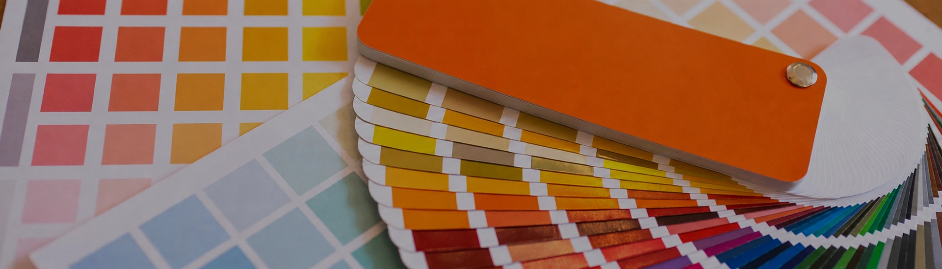

Choosing the right colour palette is key when decorating your home. While finding the perfect wall paint shade can be frustrating, a well-organized colour catalogue makes browsing and selecting from a wide range of shades quick and easy
Red is the colour most people think about and very few actually commit to. Rarely unhappy, the ones who do. A red wall done well is the kind of thing guests notice immediately and ask about. The problem is that red is genuinely one of the trickiest paint colours to land. It reacts more dramatically to light than almost anything else, and there are at least six or seven meaningfully different types of red that behave nothing like each other.
Here’s what’s actually worth knowing.
Vermillion, Red Pepper, and Fiesta from JK Maxx sit at the fully saturated end. These are proper, unapologetic reds. Most people look at them on a swatch and get excited, and then panic when they realise how big a wall actually is. One feature wall in a dining room or study — that’s where these shades find their footing. The room gets a focal point so strong that everything else in the space starts to look more deliberate.
The caveat: bright red amplifies light. In a room that gets good afternoon sun, it goes vivid and warm. In a dim room, it can start feeling oppressive. Know your light before you pick the tin.
Crimson and Cardinal have blue in the base. Cooler, deeper, more complex than a straight red. Slightly purple in morning light, a true deep red by afternoon. Cherry Cobbler sits closer to burgundy. Switch the evening lights on in a room painted Crimson and the colour goes genuinely rich. In harsh midday sun it’s a different, flatter story.
Rustique, Antique Brick, and Russet from JK Maxx have brown and orange in their base that makes them feel earthy and settled rather than loud. Rusty red and rust orange blur into each other at this end of the spectrum. That blurriness is part of why these shades are so easy to actually live with. They pair naturally with teak and mango wood furniture, brass fittings, and jute textiles — basically the standard kit of most Indian homes. Main hall walls, dining areas, and verandas all respond well. People who want red but are scared of it usually end up here. And most of them don’t regret it.
Red Brick and Santa Fe Red sit in territory that’s more earthy than dramatic. The brown undertone in these shades makes them read as warm neutrals in certain lights, especially in rooms with a lot of natural materials or stone flooring. In Indian homes with terracotta tiles or a heritage aesthetic, this shade of red paint colour makes the most sense of all. Nobody looks at a red brick wall and thinks someone got carried away.
Claret, Wine Red, and Cranberry are at the dark end. They absorb light and create enclosure rather than openness. In a compact room this is a problem. In a large study, a dining room with high ceilings, or a home library, these dark red paint colours create the kind of depth that’s very hard to achieve with lighter shades. They also pair exceptionally well with dark wood and brass — the combination looks expensive in a way that’s hard to explain and easy to see.
The most restrained version of a red room. Red walls with white skirting, white ceiling, and white trim keeps the colour from becoming overwhelming and gives the eye somewhere to rest. Bright reds like Vermillion with stark white creates a high-contrast look — sharp and confident. Deeper reds like Claret or Wine Red need a warm off-white rather than a cold stark white, or the pairing can feel slightly jarring.
Dark teak or rosewood against a deep red or brick red wall requires almost no other styling work. The red pulls the warmth from the wood grain and the room settles. Rusty reds and brick reds are the most forgiving here. Deep wine reds against very dark wood can get heavy without adequate natural light.
One wall in a rich brick red like Antique Brick or Rustique, neutral on the other three. The wall becomes the room’s anchor and everything else gets easier to arrange around it.
Deep crimson and wine shades actually work in adult bedrooms when handled carefully. Cherry Cobbler or Claret on the wall behind the bed, warm lighting, dark wood furniture. The room feels settled in a way that’s hard to achieve with lighter colours. Keep the bedlinen light. Don’t attempt four red walls in an adult bedroom unless you’re very confident about the light levels and scale of the room.
Dining rooms are where red has always made the most sense. The colour is known to stimulate appetite and conversation — this may sound like a lifestyle magazine cliché, but in practice a red dining room does feel more energised at mealtimes than a neutral one. Barn Red, Cardinal, or Indian Red on all four walls in a dining room with good lighting and wooden furniture. Nobody ever walks into a room like that and wishes it was beige.
Wine, claret, and crimson on one wall behind the bed. Genuinely doable. Full-room bright red in a bedroom is a mistake most people only make once. The colour keeps the brain active in a way that makes winding down harder than it needs to be.
White for contrast. Gold and brass for warmth and richness. Dark wood for grounding. Grey for a more contemporary pairing. Avoid strong cool blues or greens alongside red. The clash tends to feel accidental rather than considered.

