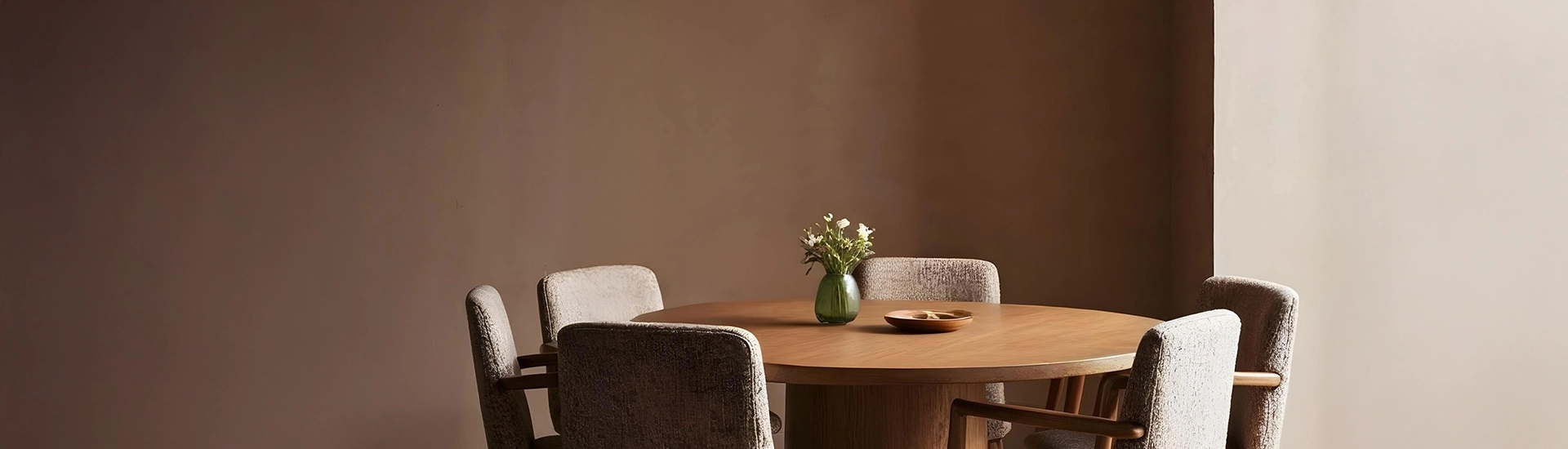
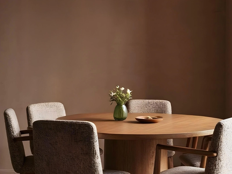
The dining room handles bold colour better than any other room in the house. It’s used primarily in the evening under warm artificial light, which is when richer, darker colours behave best. It’s rarely the room where anyone spends hours trying to concentrate or sleep. The bar for what’s liveable is lower, and the bar for what looks interesting is higher. Most Indian dining rooms play it safer than they need to.
Before picking a shade, two questions are worth sitting with before personal preference enters the room.
The most naturally Indian dining room combination. Rustique or Antique Brick from JK Maxx on the main wall behind the dining table, warm off-white on the other three. Under warm evening lighting, the terracotta glows. With teak furniture, brass lamps, and warm cotton textiles, the room reads as genuinely warm and deliberate without requiring any styling effort.
This combination also handles the practical realities of Indian dining rooms. Terracotta hides light marks better than white, it ages well, and it responds to warm evening light in a way that most colours don’t.
Navy or deep teal on one wall with cream on the other three. The room gets a specific personality without the colour taking over. The teal wall behind the dining set gives the furniture somewhere to be. Cream on the other three walls keeps the room from feeling enclosed. Brass pendant lights above the table, dark wood chairs, and simple white tableware.
This combination handles Indian dining room conditions well. Under warm artificial light in the evening, deep teal goes richer and the cream goes slightly golden. The room improves as the day progresses.
For dining rooms where you want a natural, earthy quality. Sherwood Forest or Herbal Garden from JK Maxx on the main wall, ivory or warm white on the other three. Plain green walls on their own go slightly flat. The ivory alongside reflects light back onto the green and the two colours lift each other.
Works particularly well in dining rooms that open onto a garden or veranda. The visual connection between the green wall and the outdoor space reads as planned rather than lucky.
For formal dining rooms and spaces that are used for celebratory meals. Deep burgundy or claret on the feature wall with warm beige on the other three. Under warm evening artificial light, burgundy stops being a dark colour and starts being a rich one. The beige gives the room somewhere to breathe.
Brass fixtures, dark teak, and heavy cotton or linen textiles are the natural partners for this combination. The room looks deliberately rich. Indian dining rooms that serve a ceremonial function — festive meals, family gatherings — handle this combination particularly well.
Contemporary doesn’t mean minimal or cool. In Indian home interiors, the modern dining room colors that actually hold up are the ones that stay warm while feeling current.
Warm charcoal on one wall with warm off-white on the other three. Dark timber furniture, brass pendant lights, simple white tableware. The combination is graphic and contemporary without the coldness that most all-grey rooms develop. The warmth in both the charcoal and the off-white keeps the room from feeling like a commercial space.
Sage green on the feature wall, warm white on the other three. This is the modern dining room color that keeps appearing in Indian home interiors right now. It photographs well and it lives well. Those two things don’t always go together. Sage sits quietly enough that a full dinner doesn’t feel like sitting in a colour. But it has enough character that the room feels chosen rather than defaulted to.
Eggshell or satin for dining room walls. Matte picks up finger marks and food marks in a high-use room. It can’t be properly wiped. Satin allows for cleaning without damaging the surface. This is especially relevant near the dining table where contact with the wall is more likely.
A warm off-white on the ceiling rather than stark white. During dinner conversation, people look up more than in any other room. The ceiling is part of the palette whether you treat it that way or not. A cold white ceiling against warm walls creates a visual disconnect.
Paint sample patches on the actual wall and check them specifically under your evening artificial lighting. Dining rooms are used most intensively in the evening and the colour needs to work in those conditions above all.
Light and mid-tone shades on all four walls. Pale sage, warm off-white, light terracotta, cream with a warm beige trim. One feature wall in a slightly deeper shade of the same warm direction. The room gets some depth without the walls coming in. Avoid dark shades on all four walls of a compact dining room. The space will feel significantly smaller and heavier.
Not match, but connect. If the two rooms are visible from each other, the colour in one changes what the other looks like. Keep the undertone direction consistent. Both warm, or both cool. The transition will feel natural even if the shades are quite different.
Warm off-white and cream for the cleanest result. Terracotta for a warm, earthy combination. Deep teal or forest green for contemporary contrast. Burgundy or claret for richness and depth. Avoid cool grey or cool white alongside dark Indian timber. The undertone clash tends to make the wood look heavier and the walls look grey rather than white.

