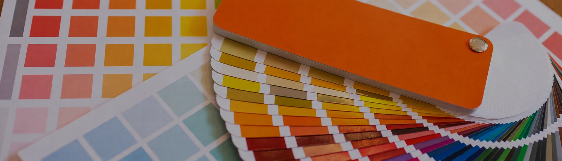

Choosing the right colour palette is key when decorating your home. While finding the perfect wall paint shade can be frustrating, a well-organized colour catalogue makes browsing and selecting from a wide range of shades quick and easy
Walk into a paint shop looking for grey and you’ll leave with a headache. There are forty options and most of them look nearly identical until you get them home. The wrong one makes the room cold, flat, or oddly blue. The right one disappears into the room in a way you don’t notice until you try a different colour. The challenge is understanding which grey you’re actually looking at. The shades of grey paint run from barely-there lilac-tinged silvers to deep charcoals that behave more like black on a wall.
Chamois and Sesame from JK Maxx sit at the lighter, warmer end of the grey family. Ask most people to point to the grey they have in mind and they’ll land somewhere in this range. Not as warm as beige, not as cold as a proper grey. In a living room or hallway, Chamois or Sesame gives the room the easy quality of a neutral without the slight chill that cooler greys bring. In morning light these shades look almost greige. By evening under warm artificial lighting they pull warmer still.
The practical advantage of these shades is that they handle the variable lighting of Indian homes better than cooler greys do. A north-facing room in a pale cool grey often goes blueish by midday. These warmer shades don’t do that.
Smokeytone and Chapel Gray sit in the middle of the spectrum. Not quite light enough to read as a neutral, not dark enough to feel dramatic. If you’re looking for warm grey paint colors that sit comfortably next to wood, brass, and natural textiles without going all the way to greige, this is the category. Good for grey paint for bedroom walls where you want something settled, and for grey interior paint in home offices where you want focus without the starkness of white.
Stormy Blue and Gunmetal from JK Maxx are the shades with a blue or green undertone. In rooms with polished concrete flooring, steel fixtures, or modern minimal furniture, these shades look genuinely right. They read as current rather than classic. In a room full of warm wood and warm artificial lighting, they can look slightly cold or mismatched. Worth testing before committing.
Wrought Iron and Iron Ore are at the deep end. These absorb light and the room goes intimate. In a dining room or study with good natural light, that quality is an asset. In a compact north-facing bedroom, it’s a problem. This is the category for people who want the effect of a dark feature wall without going all the way to black. One wall in Wrought Iron behind a sofa or bed, light neutrals on the other three.
Grey walls with white skirting and ceiling gives the room structure without the grey feeling heavy. Match temperatures though. A warm grey needs a warm off-white, not a stark cool white. A cool grey like Gunmetal handles a crisp cool white better.
Grey and warm natural timber is a combination that contemporary Indian apartments have been using for years. Grey sits behind teak or mango wood without competing with it. The timber brings warmth to the room and the grey keeps it from tipping into something that feels too traditional. This pairing is particularly good for grey paint for living room walls where the furniture does the talking.
Warm grey and golden or mustard yellow is a combination with genuine visual energy. The yellow pushes forward and the grey holds back. In a living room the room gets personality without either colour having to shout. Light grey like Chamois on the walls with mustard yellow in the soft furnishings is enough.
Chamois or Smokeytone on all four walls of a living room. A room that lets the furniture and textiles do the talking. The grey sits back and everything placed in front of it looks more considered for having a neutral backdrop. For a living room with more drama, one wall in a deeper charcoal or Wrought Iron behind the sofa, light grey on the other three sides. The room gets somewhere to look without the whole thing feeling enclosed.
Smokeytone or Chapel Gray on all four walls of a bedroom. Neither warm enough to feel stimulating nor cold enough to feel clinical. Pair with warm-toned lighting and natural linen. Cool greys in a bedroom can feel slightly clinical in rooms that get limited natural light.
Grey exterior paint is growing in popularity for Indian homes that want a modern, clean look from the street. Light grey exterior house colors like Chamois or Sesame on exterior walls look clean and modern from the street. In direct Indian sunlight they don’t glare the way white does. Darker exterior gray paint colors like Smokeytone or Gunmetal on exterior walls create a more dramatic, urban look that suits modern apartment buildings and contemporary bungalows. Both handle Indian weather conditions better than stark white, which tends to look marked and uneven within a couple of monsoon seasons.
For metal surfaces like gates, grilles, railings, and window frames, grey metal paint is the practical choice. Iron Ore or Gunmetal on metal surfaces gives a finish that looks intentional and ages better than black. It’s a particularly good choice for homes where the exterior walls are a warm grey or off-white. Grey metal fixtures tie the whole exterior together without matching too literally.
Warm grey is genuinely good for bedrooms. Chamois and Smokeytone are restful, easy to wake up in, and sit naturally next to the wooden furniture and warm textiles that most Indian bedrooms already have. Cool grey in a bedroom needs careful handling. In a room without good natural light it can start to feel slightly clinical.
White for the cleanest result. Warm wood tones for a natural, grounded look. Yellow and mustard for visual energy. Dusty pink or blush for a restful bedroom combination. Navy blue for a more serious, focused room. Avoid pairing cool grey with warm beige or warm brown. The undertone clash tends to be more visible than you’d expect.
Well, and increasingly. Light grey exterior house colors look contemporary from the street. They don’t bleach out in direct sun and dust marks are far less visible than on lighter surfaces. Dark exterior gray paint colors create a bold, modern look that suits contemporary buildings well. The key for exteriors is choosing a grey with a slight warm undertone rather than a cool blue-grey. A cool blue-grey on an exterior wall can read almost grey-green against a pale Indian sky. Not usually what people are going for.
Eggshell or satin for living rooms and hallways. Matte in bedrooms where you want a softer, more absorbed quality. Semi-gloss in kitchens and bathrooms. In bedrooms specifically, flat matte grey does something satin can’t. The colour sits in the room rather than reflecting off the surface.

