The living room takes more light changes, more foot traffic, and more scrutiny than any other room in the house. A colour that looks perfect in a bedroom can feel completely wrong in a living room simply because the conditions are different. Variable lighting across the day, different activities happening at different times, and the fact that everyone who visits your home will see it. The stakes are higher than in most other rooms.
Before picking a specific shade, the undertone question matters more in a living room than anywhere else. A warm undertone in the walls responds well to warm artificial light in the evenings. A cool undertone can start to feel clinical once natural daylight fades.
Most Indian living rooms run warm artificial lighting in the evenings. Off-white, cream, warm grey, sage green, and terracotta all handle this condition without shifting dramatically. Cool greys, blue-greys, and certain whites can look slightly wrong by 8 pm under warm LEDs. Not damaged, just slightly off in a way that’s hard to explain.
The undertone should also agree with the floor. Marble, stone, and teak are the most common living room floors in Indian homes. Warm floor materials need warm walls or at least neutral walls that don’t fight them.
Light colours are the right call for living rooms that don’t get much natural light. North-facing rooms, ground floor flats with limited windows, or rooms where other buildings block direct sun for much of the day.
Pale warm shades like Paper Moon, Navajo White, or Honey Cream from JK Maxx reflect whatever light is available. The room stays open. These aren’t boring choices. In a room with good furniture and warm lighting, a pale warm wall recedes and lets the room be about what’s in it.
Light grey in a living room requires more care. A pale grey that works beautifully in daylight can feel flat and cold by evening. If you want grey, go warm greige rather than cool grey. Test it under your actual evening lighting before committing.
One strong colour on the wall your eye finds first when you walk in. Neutrals on the other three sides. The room gets character without the colour taking over.
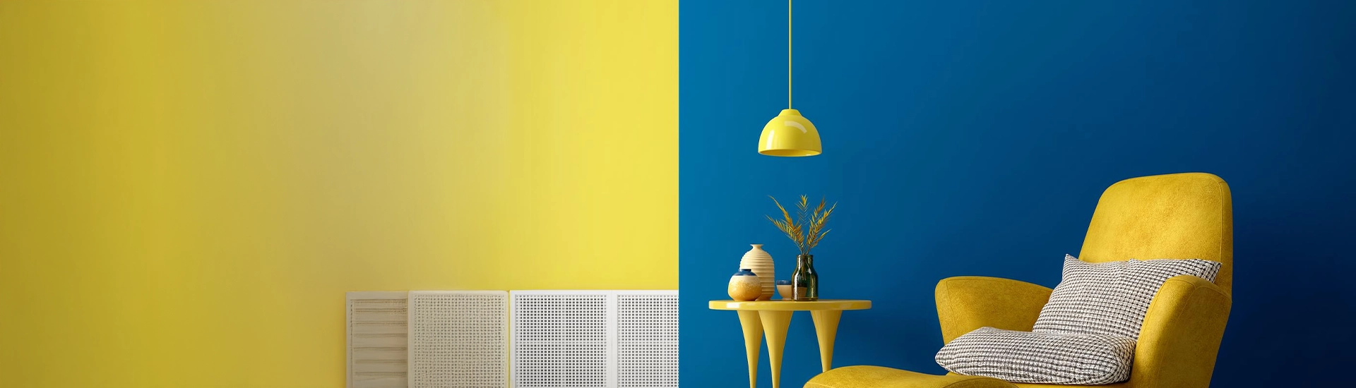
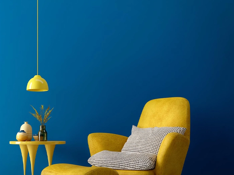
The feature wall should be the one opposite the main entrance or behind the primary seating. In most Indian living rooms, this is the wall behind the sofa or the wall opposite where you sit. Deep teal, forest green, terracotta, burnt orange, and burgundy all work as feature wall colours alongside warm neutrals. Each creates a different mood. Teal is contemporary, terracotta is grounded, burgundy is rich and celebratory.
The practical consideration: the feature wall colour needs to agree with whatever is in front of it. Dark teal behind a warm terracotta sofa creates conflict. Dark teal behind a neutral grey or cream sofa creates drama. Know what’s going in front before you choose what goes behind.
Modern and contemporary are often used interchangeably but they describe different things. Modern in the design sense means clean lines, minimal clutter, and a preference for neutral palettes with graphic contrast. Contemporary means current. Right now, earthy and organic tones are what’s actually appearing in Indian home interiors.
Warm greige, sage green, dusty rose, and terracotta on the walls alongside warm wood furniture and brass fixtures. This is the combination that reads as both current and contextually appropriate for Indian home interiors. It’s not grey and white minimalism. That tends to look cold in Indian lighting conditions. It’s warmth with restraint.
For a more graphic contemporary look: warm charcoal on one wall with warm white on the other three, dark timber furniture, and brass or copper accents. The contrast is strong. The warmth in all the elements prevents it from going cold.
Finish matters. Eggshell or satin for living room walls. Matte shows marks and scuffs in a high-traffic room in a way that eggshell doesn’t. Satin adds a slight sheen that some people find too much in a living room. Eggshell is usually the better call.
Test before committing. Paint sample patches directly on the actual wall. At least A4 size, ideally larger. Check the colour in morning light, afternoon light, and evening under your artificial lighting. All three can look different, and a colour that works across all three conditions is the one to choose.
The ceiling affects the walls. A warm off-white on the ceiling reads as part of the same warm palette. A stark cool white ceiling next to warm walls creates a disconnect that makes both look slightly wrong. Match the ceiling’s temperature direction to the walls.
Light colours reflect light and create a sense of space. Off-white, cream, and warm beige are more effective than pale cool shades in Indian living rooms. They work with the warm artificial lighting rather than fighting it. True white can feel slightly clinical. Warm off-white feels spacious and inhabited at the same time.
Two or three, working across the walls, ceiling, trim, and soft furnishings. The most reliable version: one neutral on three walls, one stronger shade on the feature wall, and the ceiling and trim in a warm off-white that connects both. The accent colour in the soft furnishings can introduce a third tone without it appearing on the walls at all.
Not match, but connect. In an open-plan home or anywhere two rooms are visible from one another, the wall colour of the living room affects what the adjacent room looks like. Warm terracotta in the living room makes the off-white of the adjacent dining room read warmer. Keep the undertone direction consistent between rooms and the transition will feel natural.

