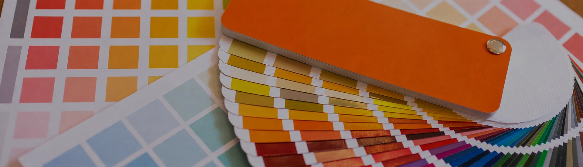

Choosing the right colour palette is key when decorating your home. While finding the perfect wall paint shade can be frustrating, a well-organized colour catalogue makes browsing and selecting from a wide range of shades quick and easy
Cream gets chosen by default more than any other colour. People don’t always decide on cream. They end up with it when they’re not sure what else to do. Which means most cream rooms are painted in the wrong shade of cream, because the decision was made without enough thought. Getting it right takes real attention. The undertone question is the whole game.
Navajo White and Morocco Sand from JK Maxx sit at the very pale end. In most lights these read as warm white rather than obviously cream. They’re the shades for rooms where you want the light quality of white without the coldness. Small bathrooms, compact studies, hallways, nurseries. Cream colors for walls in this range are genuinely useful in Indian homes because marble floors and white fittings everywhere still need a wall colour that doesn’t look clinical against them. Navajo White in a bathroom with white tiles does something white paint can’t. The room feels inhabited rather than institutional.
Vanilla Custard, Honey Cream, and Paper Moon are where most people land when they picture cream paint colors for walls. Enough warmth to register as cream, not so much that the room looks yellow. These are the shades that sit naturally next to teak and mango wood furniture, don’t fight with marble or stone flooring, and hold up reasonably well across the variable lighting of Indian homes.
Paper Moon in a living room with wooden furniture and brass fixtures doesn’t require any other decisions. The palette organises itself. That’s what people are after when they say they want cream. These shades actually deliver it.
Egg Custard and Flax Straw push into more obviously warm territory. There’s real yellow in these shades. They read more golden than classic cream. Put Egg Custard in a room with warm afternoon light and something happens that lighter creams can’t do. In a north-facing room the same shade just goes yellow. Test on the actual wall before committing.
Warm cream room colors in this range are a natural fit for dining rooms and main hall walls where the evening lighting does most of the work. Warm artificial light brings out the golden quality. Less good in a room you spend a lot of time in during the day without direct sunlight.
Chamois and Sesame are for rooms where standard cream feels too warm but grey isn’t the answer either. Polished concrete floors, grey tiles, modern furniture. Chamois sits with all of that without looking like it’s trying. In a home full of teak and brass, it can start to look like it arrived from somewhere else. Temperature matching matters more here than with any other cream shade.
The most common pairing for cream room color and the one people most often get wrong. The problem is that cream and white look fine separately and fight each other when placed next to each other if the temperatures don’t match. Vanilla Custard needs a warm off-white on the trim and ceiling, not a stark cool white. Match the undertone direction and the boundary between wall and trim virtually disappears. Mismatch it and both colours look slightly wrong without you being able to pinpoint why.
This is the pairing that Indian home interiors handle most naturally. Teak, rosewood, mango wood, walnut. The warm grain in all of these materials and the warmth in cream are on the same side. Grey walls next to dark timber tend to pull the two apart. Cream doesn’t do that. Honey Cream or Vanilla Custard against dark wood furniture in a dining room. The combination looks deliberate. Nothing else needs to happen.
Vanilla Custard or Paper Moon on all four walls of a living room. The furniture and art look better. Cream recedes enough that the room isn’t about the wall colour, but it adds a warmth that white simply doesn’t. One practical consideration: cream living room walls pick up scuffs and marks more visibly than white in high-traffic areas. An eggshell or satin finish rather than matte makes maintenance manageable.
Cream is genuinely good for bedrooms. The warmth creates a quality of rest that white doesn’t quite match. Honey Cream or Navajo White in a bedroom with wooden furniture, cotton curtains, and warm-toned lighting in the evening. You wake up to it and it doesn’t demand anything. In a bedroom that gets morning light, cream walls catch that early sun and the room just settles.
Cream is the most popular choice for Indian kitchens, and for practical reasons. It reflects the warm artificial light that most Indian kitchens run on in the evenings. It hides light cooking marks better than white. It pairs naturally with wooden cabinetry and white tiles. Flax Straw or Vanilla Custard in a kitchen with white tiles above the counter and wooden cabinetry below. A satin or semi-gloss finish so the walls can actually be wiped.
Morocco Sand and Old Linen on exterior walls look clean and welcoming from the street. In direct Indian sunlight they don’t glare the way white does. Cream exterior paint colors also age better across monsoon seasons and dust. Cream color house paint shows environmental marks less readily than white.
Off-white covers a wide range. Cream is the warm, yellow-forward end of that range. Hold a true cream swatch next to an off-white and you’ll see it. The cream has obvious colour in it. Morocco Sand and Navajo White from JK Maxx sit close to the off-white end. Egg Custard and Flax Straw are clearly cream.
Your bulbs are doing it. Warm-white or yellow-toned LEDs activate the yellow undertone in cream paint at night in a way daylight doesn’t show. Switch to a neutral or cool-white bulb. If the shift is dramatic, the shade has more yellow in the base than your lighting can handle. Try Chamois instead, which has grey in the base and is more stable under warm artificial light.
Honey Cream or Vanilla Custard in a north-facing room. North-facing rooms get cool, flat light all day and white walls in those conditions can look slightly grey by midday. Cream introduces warmth the light isn’t providing. The room won’t suddenly feel sunny. It’ll just stop feeling cold.
Eggshell or satin for living rooms and hallways. Matte for bedrooms. The flat quality suits the shade and the room. Semi-gloss for kitchens and bathrooms. One practical note on matte cream: fingerprints and scuffs show up more on cream in a flat finish than on darker or cooler colours. Any room that gets used heavily is better off with eggshell.

