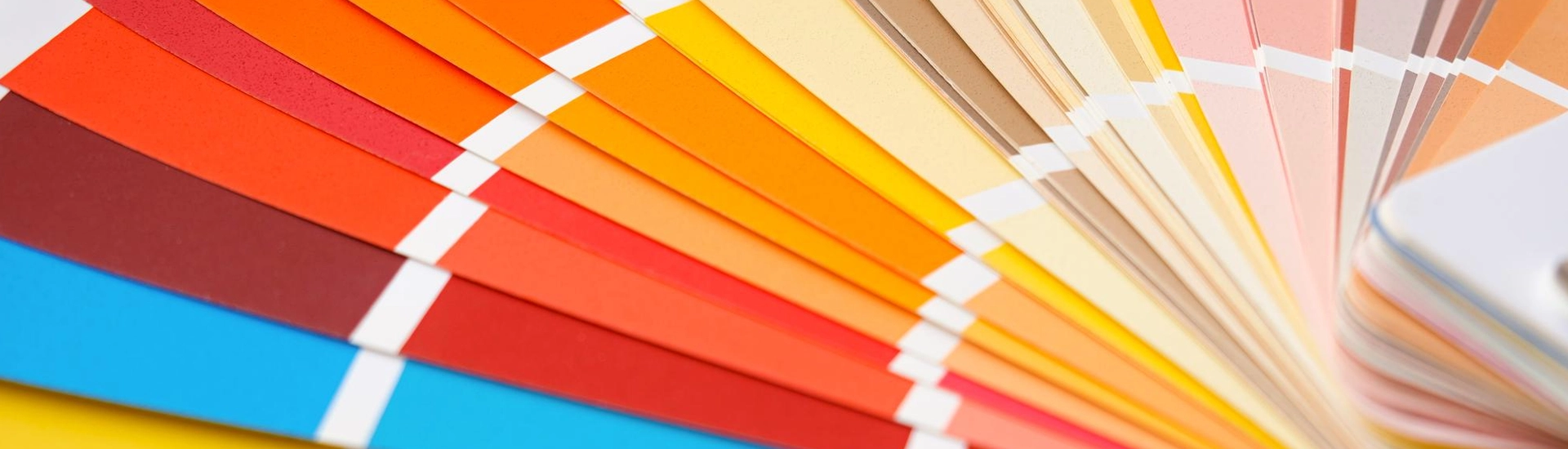

Off white is not a single colour. It is a family of colours. Each one is white with a small amount of something else added. Yellow, grey, pink, green. That addition changes how the colour behaves on a wall, how it responds to light, and what it pairs with. Most unhappy off white rooms were painted with the wrong shade of off white, not the wrong family of colour.
The JK Maxx off white range covers the full spectrum, from barely-there warm whites like Navajo White and Morocco Sand through to creamy mid-tones like Honey Cream and Vanilla Custard and the greige shades like Chamois and Sesame. The combinations below apply across this range with notes on where the specific shade matters.
Before choosing off white colors for walls, the undertone question comes first. An off white paint for wall use in Indian homes needs to work under variable lighting conditions. Bright afternoon sun, flat indirect light in north-facing rooms, and warm artificial light in the evenings. The wrong undertone will shift dramatically under these conditions and the room ends up looking either orange or grey depending on the light.
Warm off whites, the ones with yellow or cream in the base, like Vanilla Custard and Honey Cream from JK Maxx, compensate for cool light conditions. In a north-facing room or one without direct sun, warm off white introduces warmth that the light itself is not providing. The room does not suddenly feel sunny. It stops feeling cold. Under warm evening lighting these shades go slightly more golden, which tends to feel pleasant rather than wrong.
Cool off whites, the greige shades like Chamois and Sesame, hold up better in rooms with a lot of warm artificial light. These shades have grey in the base. Under warm bulbs that grey stops the colour going orange. In contemporary apartments with polished concrete, white oak, or minimalist furniture, Chamois sits without looking like someone tried to add warmth. A warm cream in the same room can start to feel traditional in a way the space does not want.
Off white colors for walls are unusually forgiving combination partners. The pairings below appear in Indian home interiors regularly and work consistently.
This is the most common combination in Indian homes. The materials share warmth without matching, which is why the room reads as a decision rather than a coincidence. Teak, rosewood, and mango wood all have warm grain tones that off white picks up and reflects back. The room reads as a single warm environment, not two decisions placed next to each other. Paper Moon or Old Linen from JK Maxx with dark teak furniture in a dining room or living room. Nothing else is required.
This is the most contemporary version of this colour on walls. Meringue or Old Linen on the main walls with a warm greige on one feature wall or the furniture creates a living room that looks modern without making a statement about it. Match temperatures carefully. A warm off white with a cool grey creates an undertone clash that is subtle but visible. Both warm, or both cool.
This combination transforms a neutral room into something with a specific personality. Paper Moon or Navajo White on three walls with one wall in a deep teal, navy, or forest green creates a room where the off white does the quiet work of reflecting light and the feature wall does the talking. The off white reflects enough light that the room does not feel consumed by the dark wall.
Most people do not think of this as a combination at all, but layering white and off white is one of the most underused approaches in Indian homes. Using creamy white wall paint on the walls with pure white on the trim, ceiling, and skirting creates depth through layering rather than contrast. Two warm tones layered over each other do something flat white cannot. Vanilla Custard on the walls with a clean warm white on the ceiling and trim. The room feels inhabited and considered rather than just painted.
Ask someone to picture a warm, inviting room and they are usually picturing a creamy white paint colour without knowing it. Vanilla Custard, Honey Cream, and Egg Custard from JK Maxx are the creamy white paint colour options in this territory. These are clearly warm, clearly creamy, and clearly not white.
In bedrooms, creamy white wall paint creates a quality of rest that pure white cannot match. The warmth in the walls and warm-toned evening lighting work together to settle the room rather than keep it alert. Creamy white on all four walls of a living room with warm timber furniture and brass fixtures looks complete. Nothing else is required.
One practical consideration: creamy white walls under warm-toned bulbs will go more golden in the evening. In a room where you spend significant time after dark, test the shade under your actual lighting before committing. The same shade that looks gently warm at noon can look orange at 9 pm. Bulb type and the amount of yellow in the base both affect this.
Off white paint works on all four walls or as three walls with one colour accent wall. All four walls in Paper Moon or Meringue creates a room that is complete and calm. The furniture, art, and textiles do the talking. The walls stay quiet. With a deep colour on one wall, the off white becomes the setting for a more dramatic room.
Off white reflects the warm artificial light that most Indian kitchens run on in the evenings. Flax Straw or Paper Moon on kitchen walls with white tiles above the counter and wooden cabinetry below is a combination that works practically and visually. These shades disguise light cooking marks better than white and reflect the lighting conditions in a kitchen better than grey.
Off white is the broader category. Cream sits inside it. The warm, yellow-forward version. If you can see the colour warmth clearly, its cream. If the warmth is subtle enough that you’d almost call it white, its off
white. In the JK Maxx range, Navajo White and Morocco Sand are off white. Vanilla Custard and Egg Custard are cream.
Warm teak and rosewood furniture for a natural Indian home palette. Warm grey on a feature wall gives a contemporary look without any colour aggression. Deep teal, navy, or forest green on a single wall creates drama that the off white walls absorb rather than compete with. Cream or warm off-white on the trim and ceiling layers two close tones to create depth.
Avoid cool grey alongside warm off white and avoid stark white trim alongside creamy off white.
Both mismatches create an undertone clash that makes the walls look dirty rather than warm.
Your bulbs are pulling the yellow
undertone out of the paint. Warm-toned LEDs and halogen bulbs activate the yellow in off white
paint at night in a way that daylight doesn’t. Switch to a neutral or cool-white LED. If the shift is
dramatic, the shade has more yellow in the base than your lighting can handle. Chamois or
Sesame from JK Maxx have grey in the base and are more stable under warm artificial light.
Its among the most practical choices for
Indian home walls. Off white colours handle the warm artificial lighting that most Indian homes
run in the evenings. They don’t go orange the way pure yellow does. Marble flooring, teak
furniture, stone tiles, brass fixtures. Most Indian homes already have these. Off white slots in
without fighting any of them. They also age well with furniture changes. In homes that evolve
over years rather than being styled once, that matters.

