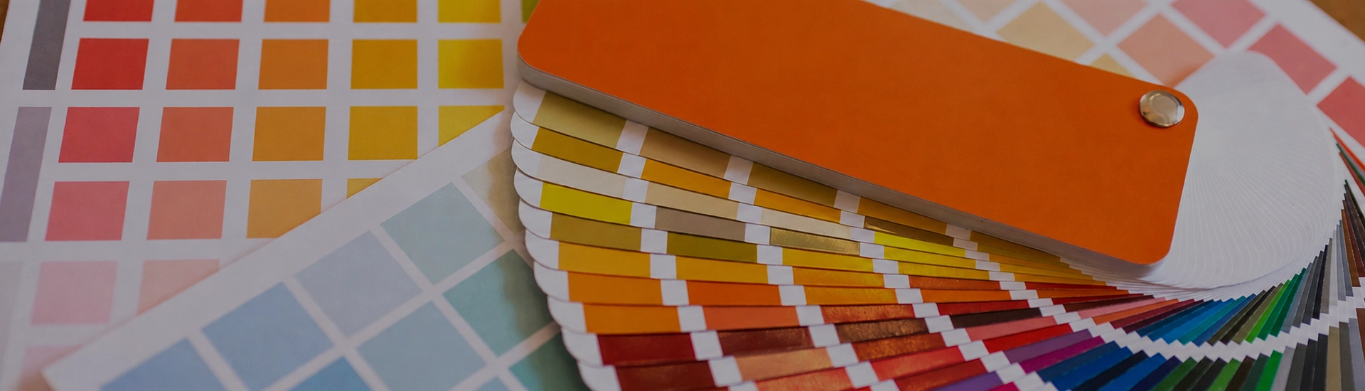

Choosing the right colour palette is key when decorating your home. While finding the perfect wall paint shade can be frustrating, a well-organized colour catalogue makes browsing and selecting from a wide range of shades quick and easy
Off white is not a boring choice. It’s one of the most demanding colour categories to get right. A saturated colour announces itself and stays put. Off white shifts depending on the time of day, the direction the room faces, and what else is in it. Buy the wrong tin and the room ends up looking dingy, slightly yellow, or just flat.
Get it right and the room looks finished without the walls drawing any attention to themselves.
Vanilla Custard, Honey Cream, and Egg Custard from JK Maxx sit in the warm, yellow-based end of the off white family. These are the shades that read as cream rather than white. There’s real colour in them. Just not much. In a room with warm natural light, Vanilla Custard on the walls and white on the ceiling creates a layered warmth that’s nearly impossible to achieve with pure white alone. In a room with limited light or a north-facing aspect, that same shade goes yellow by midday. Test on the actual wall before you buy the full tin.
Paper Moon, Meringue, and Old Linen sit in the range that most people mean when they say off white. Not quite cream, not quite white. They read as warm without being obviously tinted. In most Indian homes with marble floors, wooden furniture, and moderate natural light, these are the shades that just work without requiring much management. Paper Moon in a hallway or living room looks like it required no thought. It usually required quite a bit. They also outlast furniture changes better than shades with more tint.
Chamois and Sesame from JK Maxx sit at the greige end. Off white with a grey or taupe undertone rather than a yellow one. In a contemporary apartment where standard cream would feel dated, this is the category. Polished concrete floors, light grey tiles, modern minimal furniture. Chamois sits with all of that without looking like it’s trying to be warm. Put it in a room full of teak and brass and it starts to feel slightly cool. The undertone question matters more with greige than with any other off white.
Flax Straw and Morocco Sand are close enough to white that they read as white in photographs and only reveal their warmth in person. Small bathrooms, compact studies, children’s rooms — any space where you need maximum perceived brightness but find pure white too stark.
Natural timber is the most forgiving combination partner off white has. Teak dining tables, mango wood shelves, rosewood furniture. Pure white against dark wood can make the furniture feel heavy. Paper Moon or Vanilla Custard don’t do that. The warmth in the wall picks up what’s in the timber and the room reads as a single palette rather than two separate things placed in proximity.
Meringue or Old Linen on the main walls with a warm grey feature wall creates a living room that reads as considered and calm. The key is matching temperatures. A warm off white with a cool grey will create an undertone clash that’s subtle but visible. Keep both warm, or keep both cool.
Soft pastel colours — pale blue, dusty sage, blush pink — sit beautifully against an off white wall. Off white gives the pastel space to be seen rather than competing with it. Old Linen on the walls with pale sage green in the curtains and bedding. Nobody walks in and thinks it was hard to do, but it usually was.
An off white living room is not a room that gave up on colour. It’s a room where the furniture, art, and textiles are doing the talking and the walls know their place. Paper Moon or Meringue on all four walls of a living room — everything else in the space gets to be the thing you notice. In a home where the furniture changes and evolves, this is also the most practical choice. Off white walls work with almost any direction a room takes over the years.
Warm off whites are genuinely good for bedrooms. Vanilla Custard or Honey Cream on the walls creates a room that feels occupied and gentle rather than stark. In north-facing bedrooms especially, the warmth of these shades compensates for the cool indirect light that white walls would make worse. In morning light, warm off white walls have a particular quality that’s easier to notice than to describe. The room just feels ready. Keep the ceiling white.
Flax Straw or Paper Moon on kitchen walls with white tiles and wooden cabinetry. This combination has been working in Indian homes for decades. Off white is also more forgiving with cooking marks than pure white. The slight tint disguises the inevitable light marks better than a stark surface. Use satin or semi-gloss finish so the walls can actually be wiped down.
Morocco Sand and Old Linen on exterior walls read as clean and neutral from the street without the glare of pure white in direct afternoon sun. Indian sunlight is intense, and a stark white exterior can feel washed out and harsh. Off white ages better and handles that brightness more gracefully.
Warm-toned LED or halogen bulbs activate the yellow undertones in off white paint. During the day those undertones are barely noticeable. Under evening light they take over. Switch to a neutral or cool-white bulb, or move to a greige shade like Chamois or Sesame that has less yellow to pull out. Most people blame the paint. It’s usually the bulbs.
Better than most colours. Off white reflects light without the coldness of pure white. Small rooms feel bright rather than clinical. The shades to avoid in small rooms are the ones at the creamier, more yellow end. In a room with limited light, they start to feel slightly heavy. Morocco Sand or Flax Straw are the safer choices for compact, lower-light spaces.
Eggshell or satin for living rooms and hallways. Flat matte off white can go slightly chalky in rooms where the light varies across the day. In bedrooms, that chalky, soft quality is actually what you want. Semi-gloss in kitchens and bathrooms. Off white is more affected by finish than most colours. The sheen level changes how much the undertone shows.

