How to Make Purple Colour: A Simple Mixing Guide and Wall Ideas
Mix red and blue in roughly equal amounts, which is the answer most of us first learned with poster colours in a school art class. Simple enough.
The longer answer gets more interesting, because the wrong red can turn your purple into a dull brownish mess before you notice what went wrong. This guide explains why that happens and how to avoid it. After that, we’ll look at purple on walls at home. Plenty to cover.
Think of a ripe jamun and the deep, clear purple it leaves on your fingers, with not a trace of brown anywhere in it. That’s the target. Most people want exactly this shade.
The red decides everything. A lot of reds lean slightly orange, and since orange carries yellow, which sits opposite purple on the colour wheel, it quietly dulls the mix until it looks like dried mud.
So reach for a cool red, closer to crimson or magenta, and pair it with a blue that leans a little warm, like ultramarine. Clean purple follows. Almost every time.
Start tiny. A teaspoon of each on a plate tells you far more than a full cup, and it wastes far less paint when the mix goes wrong.
White takes over fast. Lavender is just purple with white added, but two extra drops can turn a rich purple into a pale lilac you never meant to make.
A deeper shade needs a touch more blue, or the smallest possible speck of black, which is far stronger than it looks on the brush. Careful here. Too much black and the colour goes flat and grey.
Now the dusty look. The muted purple you see in stylish homes comes from adding a very small amount of yellow, which softens the brightness while keeping the colour recognisably purple.
A little extra red pushes the mix towards a warm plum, while extra blue edges it towards a cooler violet that feels more modern in most rooms. Tiny changes matter.
Working out how to make purple colour for a school project? Squeeze red and blue poster colours side by side on an old steel plate, then let your child drag them together with a brush and watch the new colour appear. Instant magic.
It usually ends with purple fingers and a very pleased child, so keep an old cloth nearby while they work. Poster colour washes off skin easily. School uniforms are less forgiving.
Paint and light behave differently, which is why red and blue light on a phone or TV screen combine into bright magenta, while the same two paints give you a darker purple. Different rules entirely.
That’s also why a purple you pick from a photo on your screen rarely matches what comes out of the tin at home. Trust the wall.
Mixing purple for a painting is fun, but a single 10 by 12 bedroom needs several litres of paint, and matching a hand-mixed shade again halfway through is nearly impossible. Walls end up patchy.
Machine tinting fixes it. JK Maxx purple shades are mixed to a fixed formula, so the second tin you open matches the first one exactly, even months later.
The range runs from barely-there lavenders like Grape Ice and Delicacy through to deep tones like Mulberry, and most dealers can show you painted swatches instead of tiny paper chips. Ask to see them.
Buy a sample pot before committing to the full quantity, and paint a patch big enough to judge properly at different times of day. It costs very little. Repainting costs a lot.
Purple carries both warm red and cool blue inside it, which explains why it gets along with far more colours than most homeowners expect. Here are four good partners.
Cream is the easiest. Flax Straw from JK Maxx on three walls with Orchid Dew on the fourth keeps a room soft and warm from morning until late evening.
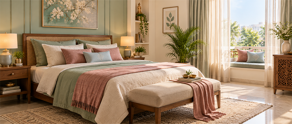
Sage green is the surprising one, because muted lilac beside a soft green reads like a garden in bloom, especially in rooms with plants near the window. Keep both shades gentle.
For a modern edge, a purple colour combination for wall with grey works best when that grey leans slightly beige, like Sesame from JK Maxx. Cold, bluish greys next to purple can make the room feel chilly by evening. Avoid those.
Mustard sits opposite purple on the colour wheel, so a mustard cushion against a violet wall really stands out without the room feeling chaotic. Use it in fabric only.
Bedrooms suit the softer end of purple, because deep shades on every wall can feel heavy at night, especially in a room with one small window. Go gentle here.
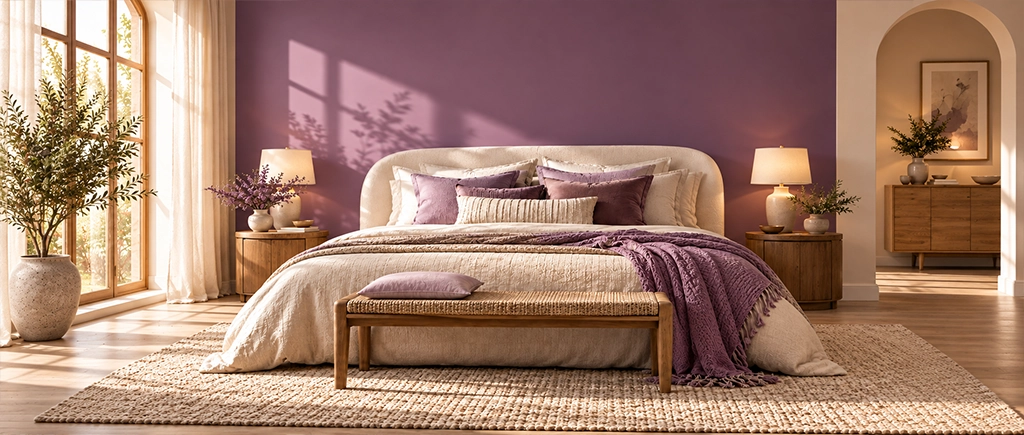
The gentlest purple two colour combination for bedroom walls is Zesty Lilac on the wall behind the bed and Meringue from JK Maxx on the other three walls. Calm by morning. Cosy by lamplight.
Want more drama? Paint only the headboard wall in a deeper shade like African Violet and keep everything else pale, so the dark wall frames the bed.
A fair compromise, this one. Lavender beside a dusty rose feels warm and slightly romantic, which is why it’s popular with couples who can’t agree on a single colour.
If your bedroom faces west, lean lighter, because strong afternoon sun can make a mid purple look almost pink by 4pm in summer. Lilac holds steady.
Red and blue. A cool red like crimson paired with a warm blue like ultramarine gives the cleanest result you’ll get at home. Orange-leaning reds turn it muddy.
Your red probably had too much orange in it, and the yellow hidden inside orange dulls purple very quickly. Switch to a cooler red. Try again.
It can be, in softer shades like lilac or lavender on one wall with cream on the other three. Very dark purple everywhere feels heavy. Keep it light.