Wall Colour Shades: How to Choose WhatActually Works on Your Walls
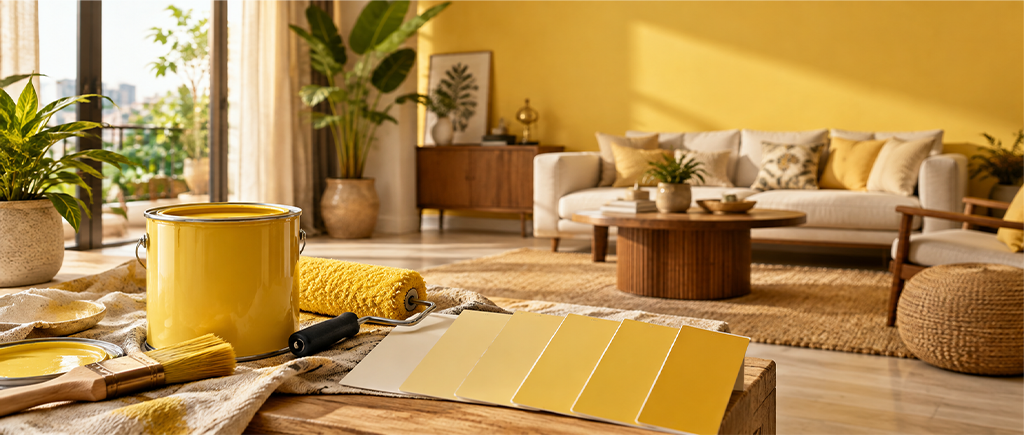
Picking a wall colour shade from a fan deck or a website is one of the more unreliable ways to choose paint. The shade on the card is photographed under studio lighting. It’s printed on coated paper with completely different reflectance to your plaster. You’re looking at it in a paint shop that shares nothing with your actual room. Back home it looks different. Paint a patch and by evening it looks different again. This is expected. Shades behave differently in a real room than they do on a card.
A few things about how shades behave in Indian conditions make this process considerably easier.
Every wall colour shade has an undertone. A secondary colour sitting beneath the dominant hue that becomes visible under certain lighting conditions. A warm beige has yellow or pink in it. A cool grey has blue or green in it. A white has pink, yellow, blue, or grey depending on the formulation.
Undertones matter in Indian homes because most rooms run warm artificial lighting, LEDs, halogens, or warm-white bulbs, for several hours every evening. Under warm light, warm undertones intensify. A warm beige goes more golden. A warm white goes more cream. Under the same warm light, cool undertones go wrong. A cool grey-white can look slightly greenish. A blue-toned wall can look slightly grey.
The practical test: hold the paint shade card under a lamp that replicates your evening lighting, not under natural daylight. The undertone under that light is what you’ll be living with most evenings.
North-facing rooms in India run on flat, cool, indirect light all day. Warm paint shades sit well in this light without the room going cold. Cool paint shades in the same conditions go slightly grey by the afternoon.
South and west-facing rooms get direct warm sunlight for large parts of the day. The sunlight warms everything in these rooms. A slightly cooler shade handles that energy well. A cool sage or a grey-blue that goes flat in a north-facing room reads as fresh in a south-facing one.
East-facing rooms get warm morning light and cool, flat light in the afternoons and evenings. The paint shade needs to work in both conditions.
Light colour shades for walls reflect light and redistribute it across the room. This quality is why they’re useful in rooms with limited windows, not just because they make the room look bigger.
The catch: not all light shades do this the same way.
Warm light shades: off-white, warm cream, pale terracotta, light sage. These work under both warm and cool light without shifting. Under Indian evening lighting, they go slightly more golden without looking wrong. In rooms with limited natural light, the warmth they introduce covers for the flat light.
Cool light shades: pale grey, cool white, light blue, pale lavender. These bounce available light well but in a room without daylight they can start to feel clinical. In well-lit rooms, cool light shades look crisp and fresh. In dim rooms, they can look flat.
The most practical light colour shade for Indian walls in rooms with limited natural light: warm off-white in the Navajo White or Paper Moon range. It bounces available light, it handles warm evening artificial lighting without going wrong, and it sits quietly on the wall without announcing itself as a colour decision. JK Maxx shades: Navajo White, Paper Moon, Morocco Sand, Old Linen.
Paint shades for wall use come in a range from barely-there pastels to deeply saturated full-strength colours. Getting the depth right means knowing what depth actually does to a room. Perceived size, light quality, visual weight. All three shift with shade depth.
Pale shades (Navajo White, Lilac Snow, Herbal Garden in its palest form): Maximum light reflection. The room stays open. Better where you want space over personality.
Mid-tone shades (Chamois, Heather Mist, Herbal Garden at mid-tone, Stormy Blue): Some depth, still reflects reasonable light. These are the most versatile shades for Indian living rooms and bedrooms. They have enough colour that the room looks like a decision was made. Without the visual weight of a saturated shade.
Deep shades (Sherwood Forest, Eggplant Delight, Crimson, Tobacco Brown): Low light reflection, high visual weight, the room goes enclosed. Good as feature walls, in rooms with high ceilings and strong natural light, or in dining rooms where enclosure is the point. On four walls of a compact room without good light, these shades are genuinely hard to be in.
The most common mistake: choosing a shade at its full-strength deep tone on the fan deck and then being surprised when four walls of it feel oppressive. At 40 square metres of wall space, that dramatic small card becomes a room you need to leave.
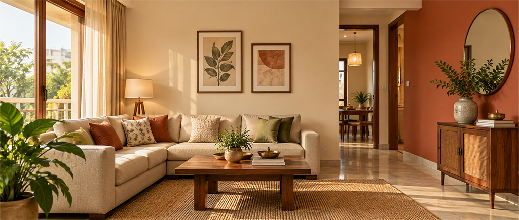
Living room: Mid-tone warm shades on all four walls, or a light shade on three walls with a mid-tone or deep shade on the feature wall. The living room sees the most variable light across the day and is the most forgiving room for shade depth.
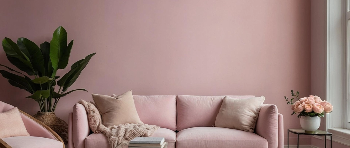
Bedroom: Cooler, more muted shades in the mid-tone range. The blue-purple spectrum, muted sage, dusty rose. These shades help the brain settle rather than staying active. Avoid saturated warm shades in bedrooms.
Kitchen: Light warm shades. Off-white, pale sage, warm yellow. Kitchen walls get cooking vapour and warm artificial light. Light warm shades handle both without going flat.
Children’s room: Light and mid-tone shades rather than saturated primaries. Bright primary colours that look cheerful on a chip can be relentless on four walls. Light sage or warm yellow are genuinely liveable. Not just nice to look at. Saturated red or blue is not.
Hallway: Warm shades regardless of depth. Hallways rarely have good natural light. Terracotta, warm off-white, and dusty rose bring the warmth the light isn’t providing.
The card is photographed and printed under controlled conditions. Your wall is plaster under natural and artificial light. A larger surface makes any colour read stronger. What looks subtle on a chip looks noticeably deeper on a wall. Paint a test patch of at least A4 size on the actual wall and check it across morning, afternoon, and evening conditions.
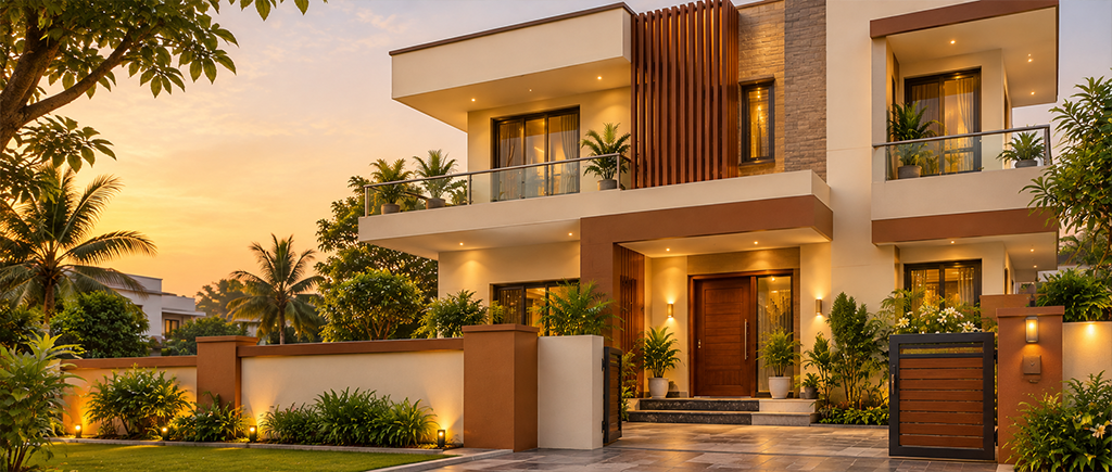
Warm off-whites and creams for rooms that need to work across all conditions. Mid-tone sage greens and warm greys in contemporary Indian homes. Terracotta in Indian homes with traditional materials. Deep teal and forest green as feature wall shades. The JK Maxx colour range organises these across warm and cool families with the undertone clearly indicated for each shade.
Most rooms work best with two. One dominant shade on three walls, one secondary on the feature wall. Three shades on three separate walls tends to look like nobody agreed on a direction. If you want a third element, introduce it through the ceiling treatment or the soft furnishings rather than a third wall colour.