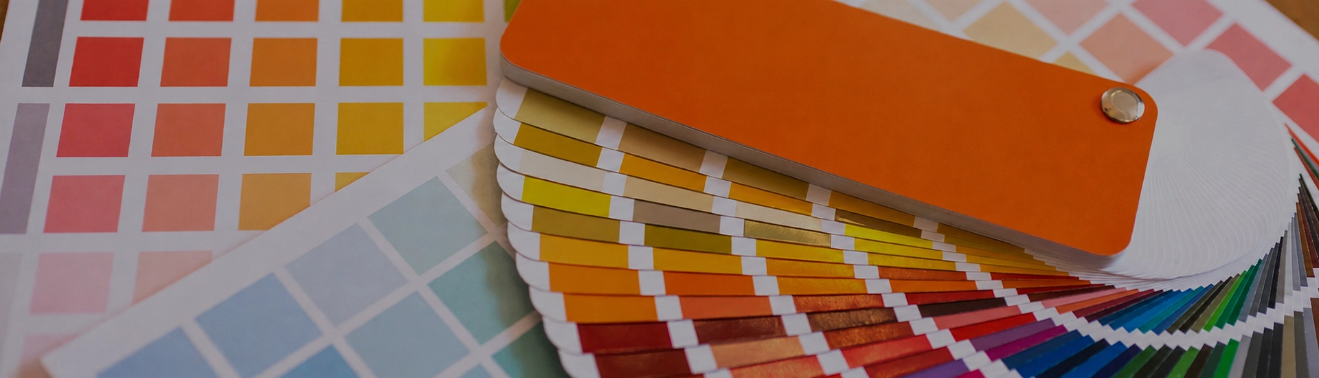
Choosing the right colour palette is key when decorating your home. While finding the perfect wall paint shade can be frustrating, a well-organized colour catalogue makes browsing and selecting from a wide range of shades quick and easy
Blue is one of those colours that looks completely obvious until you’re actually standing in a paint shop trying to choose. There are about forty different blues on the wall, and every single one looks different once it goes up in your home. Pick the wrong one and your bedroom ends up feeling like a waiting room at an airport. Pick the right one and you won’t stop looking at the wall.
Sky blue is the least risky choice in the whole colour family. JK Maxx shades like April Sky, Faraway Sky, and Light Sky have a clean, open quality that makes rooms feel airier without actually changing the size. Natural light is where these shades do their best work. Stick April Sky on a wall that gets afternoon sun and the room opens up properly. In a room that barely gets sunlight, it can go a bit thin and pale, so slap a large patch on the actual wall and look at it across the day before buying the full tin.
This is a pretty separate conversation from sky blue, even though they sound similar. Lullaby Blue, Little Boy Blue, and Calm Dawn have a grey or lavender base that keeps them quiet rather than bright. Put one of these in a bedroom and the room just settles. One thing to watch: in a north-facing room with cool flat light all day, these shades can start looking grey rather than blue. Check before you commit to all four walls.
Nobody uses navy blue paint halfway. You either go for it on a full wall or you don’t bother. JK Maxx shades like Navy Blue, Midnight Sky, and Deep Marine are the kind of choices that completely transform a living room when done well and look like a mistake when they’re done badly. The mistake is always the same: going navy without accounting for the light. A navy wall in a bright, well-lit room with light furniture is extraordinary. The exact same shade in a dim room with dark flooring makes the room feel like a cave. Get the lighting right first.
Peacock Blue, Mosaic Tile, and Aegean Blue from JK Maxx sit in this territory. Teal sits well next to natural wood and brass, which most Indian homes already have plenty of. It’s also the shade that works in kitchens where a standard blue would make everything feel clinical. The catch is that teal is a real shape-shifter. Morning light and it looks green. Switch the evening lights on and it reads much more blue. You genuinely need to live with a big swatch for a couple of days before committing.
Olympian Blue, Royal Fair, and Cathedral Blue are bold choices that most people talk themselves out of and then regret. On a single feature wall in a living room or study, a deep royal blue looks like a genuine design decision. Pair with white trim, neutral on the other walls, and enough warm lighting so it doesn’t go cold after sunset.
Blue walls with white skirting and ceiling are so common in Indian homes because nobody ever looks at them and wishes they’d done something different. It just works. What most people don’t think about is matching the temperature. Light Sky is a cool blue, so it needs a cool, stark white. Calm Dawn has grey in it, so a warm off-white is a much better partner. Mismatch the temperatures and both colours look slightly off without you being able to explain why.
Put teak or mango wood furniture against a blue wall and something clicks. Grey walls make dark timber look cold. White walls make it look heavy. Blue somehow absorbs the warmth from the wood and gives it back to the room. Navy Blue or Midnight Sky behind a teak dining table has a richness that’s genuinely hard to get with any other wall colour. With lighter blues, cane or pale natural wood works in the same way, just quieter.
A living room in navy or deep blue is a real commitment, but the ones that work are usually the most impressive rooms in the house. One feature wall in Midnight Sky or Olympian Blue with neutral walls on the other three sides is the right approach for most people. All four walls in deep blue require light furniture and warm lighting to pull off.
Adult bedrooms are where muted blues really earn their place. Lullaby Blue or Calm Dawn on bedroom walls creates the kind of room where winding down actually happens. Light curtains, warm-toned evening lighting, and you’re done. One thing to be careful of: the brighter and more saturated the blue, the more alert the room feels. Great for a study. Less great for sleeping.
Blue in a kitchen is underused in Indian homes, and it shouldn’t be. A clean sky blue or teal shade like April Sky or Peacock Blue on kitchen walls reflects light well, makes the space feel fresh, and doesn’t show cooking marks the way white sometimes does. Pair with white tiles and wooden shutters and the whole thing looks genuinely considered. Avoid very dark blues in a small kitchen. They’ll absorb whatever light you have.
Cove Blue or Copen Blue with white fittings and chrome taps is the bathroom combination that always gets commented on. It looks like someone actually thought about it. In a small bathroom with no window, go lighter. Sparkling Dew or Angelic Blue rather than anything deep. A dark marine blue in a windowless bathroom will make the room feel like a cupboard.
Muted, greyed-out blues are the ones that actually help with sleep. Lullaby Blue, Calm Dawn, and Clarity are softer choices that don’t stimulate the brain the way brighter blues do. Avoid anything too saturated or vivid if rest is the priority.
Not a great idea. Dark blue absorbs light, so a small room painted navy or deep marine ends up feeling like it got even smaller. If you’re set on it, one wall maximum with white on the other three. Or go with a mid-tone like Copen Blue or Cove Blue. You get the depth without the room closing in.
White is the safest and most reliable partner. Yellow and warm wood tones work especially well in Indian homes. Grey pairs well for a contemporary look. Burnt orange or terracotta accents with a deep blue wall is a combination worth trying in living rooms.
Not the obvious choice. North-facing rooms sit in cool indirect light all day, and a sharp cool blue in that environment just reads grey. April Sky and Faraway Sky have enough warmth in them to hold up. A stark, cold blue will look flat and a bit sad by midday.
Matte in bedrooms, eggshell in living rooms. Satin finish on a deep blue does something strange. The colour starts looking almost plastic, especially in artificial light. Semi-gloss is strictly for kitchens and bathrooms. With dark blues especially, anything with sheen is a mistake.

