Room Paint Colors: How to Choose for Each Room and What Multi-Color Paint Does
The wrong paint color in a room registers before you’ve sat down in it. The space seems smaller than it is, or the light feels flat, or the color is making you want to leave a room you haven’t sat down in yet. The right one and the room just works. You settle. The light behaves. The furniture looks like it belongs. Most people put it down to expensive furniture or good taste. It’s usually the paint.
This guide covers room paint colors by room type, explains what wall paint colors actually do to the people in them, and addresses multi color wall paint. What it is, what it’s good for, and where it goes wrong.
Paint color is not just visual. The color on the walls changes how the space feels. How large it seems, how warm or cool the light reads, whether the brain settles or stays active. This isn’t psychological theory. It’s practical. Consistent enough to be useful when making real decisions.
Warm wall paint colors, terracotta, burnt orange, warm yellow, warm beige, make the room feel warmer and smaller. In a large room with high ceilings and good natural light, this works in your favour. The room feels occupied rather than oversized. In a compact room without much light, the same quality becomes a problem.
Cool wall paint colors, blues, greens, grey-blues, lavender, make the room feel cooler and more open. In a small room with limited natural light, cool colors open the space visually but can make it feel cold. In a room with strong warm light from a south or west-facing window, cool colors get fresh and handled. The same light on a warm color pushes it into something too hot.
Neutral wall paint colors, warm greys, greiges, warm off-whites, act as background. Perceived warmth doesn’t shift noticeably. The room doesn’t read as larger or smaller. Their value is this: they don’t fight with anything in the room and they handle variable lighting conditions better than either warm or cool colors.
The bedroom needs a paint color that helps the brain slow down. The color psychology is specific: warm saturated colors, bright orange, vivid red, strong yellow, keep the nervous system active. These keep the nervous system alert. A bedroom doesn’t want that.
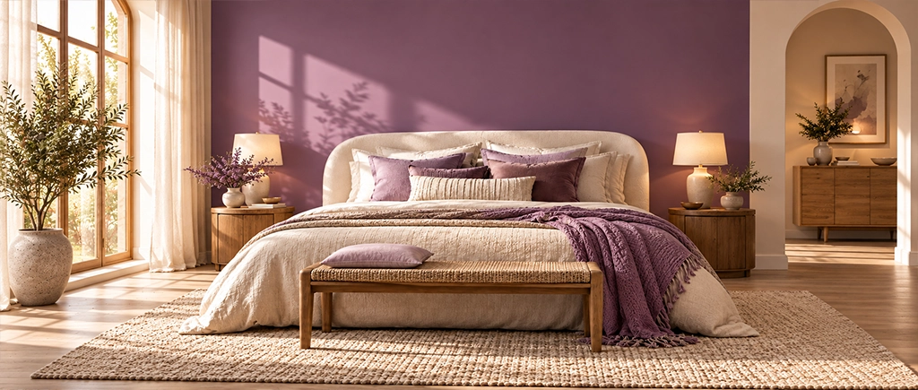
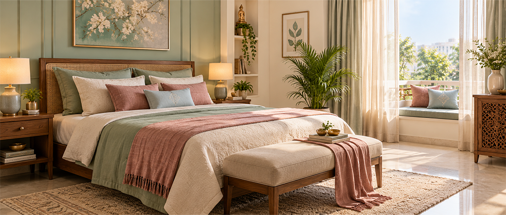
For Indian bedrooms: muted lavender, cool sage green, dusty rose in the grey-brown range, warm grey. These shades don’t trigger anything. The brain settles. JK Maxx shades: Pearl Lilac, Herbal Garden, Heather Mist, Chamois.
Deep navy or forest green on the feature wall behind the headboard, with a lighter neutral on the other three walls, is the more dramatic bedroom version. The enclosure quality of a dark feature wall works in a bedroom where enclosure equals comfort.
Living room paint colors are doing more work than bedroom colors. More activities, more variable lighting. The living room is used across the full day, under different types of light, for different purposes. Morning daylight, afternoon sun, and warm LEDs in the evening. The paint color needs to hold up in all three.
Warm neutrals, warm off-white, warm greige, warm light grey. These don’t go wrong under any of them. A deeper accent wall in teal, forest green, or terracotta gives the room a point of interest. The rest of the room stays neutral.
JK Maxx shades for living rooms: Navajo White or Chamois as base wall colors, Stormy Blue or Sherwood Forest as feature wall options.
Kitchen paint colors in Indian homes deal with warm artificial lighting, cooking vapour, and the need to feel clean rather than institutional. Off-white, pale sage, and warm light yellow all work. Warm kitchen lighting doesn’t push them orange. They hide light cooking marks better than stark white. And they read as fresh rather than clinical.
Semi-gloss or satin finish on kitchen walls only. Matte walls in kitchens absorb cooking residue and can’t be properly cleaned without damaging the paint surface.
Small, often without natural light, always with moisture. Light, cool colors work well in bathrooms. Pale aqua, pale blue, light sage, warm off-white. Lighter and cooler shades open the space visually. Semi-gloss or satin only. Matte doesn’t handle bathroom moisture.
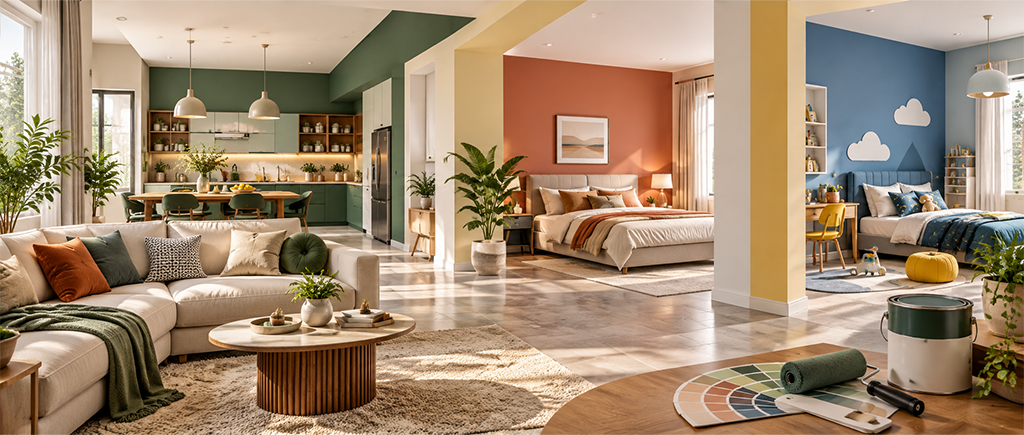
Multi color wall paint refers to two or more colors applied to a single wall or across a room as a design decision. Distinct from simply having different rooms in different colors. The techniques include horizontal splits (darker below, lighter above), gradient applications, two-color feature walls, and pattern work.
A horizontal split, darker color on the lower third or half of a wall and lighter color above, is the most practical multi color wall paint application in Indian homes. It grounds the room visually. The darker lower section does the practical work of hiding the marks and scuffs that hallways and dining rooms collect. And the proportion break creates the impression of a chair rail without the furniture. Charcoal or terracotta below a warm off-white above is the most common version.
Two colors applied to a single feature wall in geometric or freehand pattern. This is the most design-intensive multi color wall paint application and the one most likely to look wrong without a skilled painter and a clear plan. The colors need to share undertones. Both warm, or both cool. Otherwise the pattern creates visual tension rather than visual interest.
A gradient from one color to another on a single wall. In Indian home interiors, this works best with two shades of the same color, a lighter and darker version of sage green for example, rather than two different colors. Two genuinely different colors in a gradient need very controlled application. The middle transition tends to go muddy.
Light, cool-leaning colors on all four walls. Pale aqua, warm off-white, light sage. Avoiding high contrast between walls and ceiling also helps. A white ceiling against a significantly darker wall creates a visual lid that makes the room feel lower. Matching the ceiling to a slightly lighter version of the wall color removes the lid effect.
In practice, yes. Dark colors eat light and add visual weight. The room closes in. In a large room with high ceilings and strong natural light, a dark color creates enclosure that reads as intentional. In a compact room without good natural light, a dark color shrinks the space. The room’s size and light quality decide this.
Yes, with care. A horizontal split with a darker lower third and lighter upper two-thirds can make a small room feel taller. Two different strong colors on two different walls in a small room. The room ends up looking like it couldn’t decide on a direction. Keep multi color applications to one wall or a controlled proportion of the room.