How to Mix Three Paint Colours in a Single Room
We have all walked into a home and instantly felt cozy. You might not be able to put your finger on exactly why, but the whole vibe just works. Nine times out of ten, it is not the expensive furniture — it is how the walls have been balanced.
Plain white is safe. A two-tone setup is fine. But choosing a three colour combination is where your home actually gets some personality. Using three shades adds visual depth and helps section off parts of a room without building physical partitions.
Still, staring at a massive paint catalog can make you want to throw your hands up and stick to basic beige. If you want to find the best wall colour combination for your home without making your walls look chaotic, you just need a few basic design principles.
There is no hard math involved here. It is just a simple ratio decorators use to stop multi-coloured spaces from looking cluttered. Think of your room’s visual layout as a pie chart:
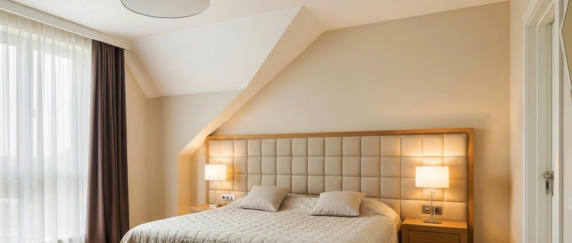
This is your main background shade. It goes on most of your walls and the ceiling. Use something light and easy here — like a soft cream or an off-white. It gives the room breathing space and keeps it from feeling cramped.
This brings the character. It should take up about half the space of your base coat. Paint one large accent wall with this, or use it on built-in bookshelves and major furniture pieces.
This is the fun part. Keep it small. Just a splash of a bold colour on window frames, cushions, or a wall niche to draw the eye.
Using this ratio helps ensure your chosen room colour combination feels balanced and easy on the eyes, whether you like quiet earthy tones or deep, dramatic shades.
Want a room that feels like a quiet forest floor? This is your mix. Sand beige is your 60% base because it is warmer and friendlier than clinical white. Then, paint the wall behind your bed or sofa in a muted sage green (your 30%). For the final touch, bring in clay-toned terracotta (the 10%) through a painted archway, shelves, or throw pillows. It is an excellent mix for living rooms or bedrooms where you want to sit back and destress.
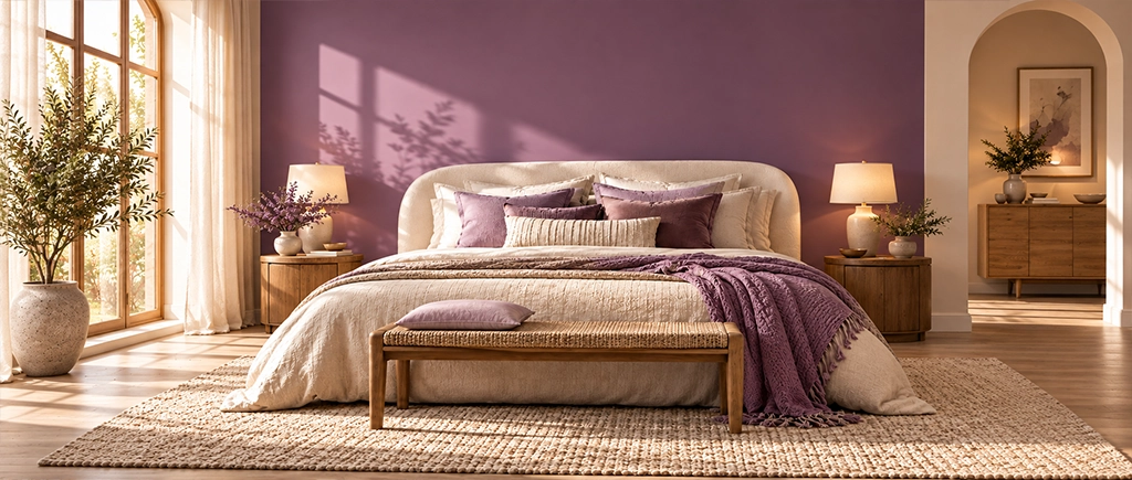
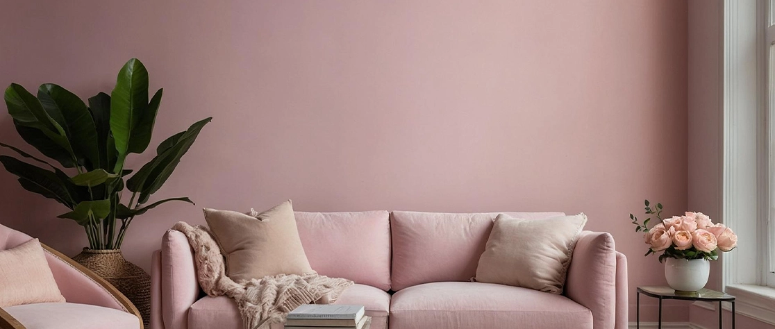
If you like clean lines but do not want your house to feel like a cold hospital lobby, try this. Keep the space feeling open by using a soft off-white on three of the walls. Use a deep slate grey on a single wall — maybe the one with your TV unit — to give the room some structure. To stop the grey from feeling too harsh, bring in dusty pink as your accent. Put it on curtains, light fixtures, or a cozy rug. It is a great fit for home offices or main bedrooms.
You do not need to live near a beach to enjoy coastal colours. But instead of bright sky blue, go for deep navy. Navy blue is stable and classic, while a warm cream base stops the space from feeling cold. To make it pop, use mustard yellow as your 10% accent. Paint your main walls in cream to catch the light, use navy on a focal wall, and throw in mustard accents through cushions or framed art. This works well in dining areas or busy family living rooms.
For a space that feels like a warm hug, try pairing deep burgundy with earthy taupe and clean ivory. Burgundy is dramatic and rich, taupe keeps things grounded, and ivory keeps the whole room from feeling like a dark cave. Use ivory as your main background, paint adjacent walls in soft taupe to wrap the room in comfort, and use burgundy for features like wall panels, wainscoting, or a cozy entryway wall. It is a great match for formal dining rooms or a reading nook.
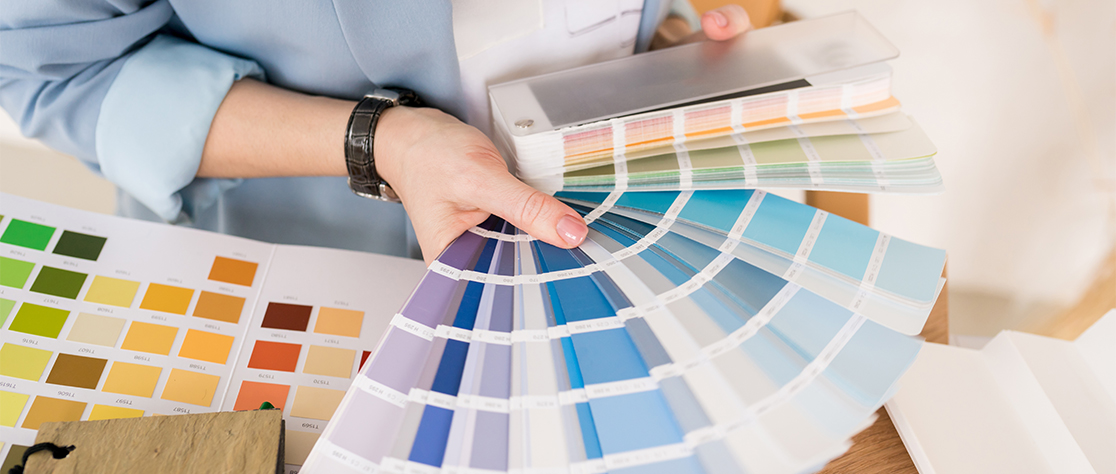
Looking at a tiny paper card in a shop is very different from seeing paint on your actual living room walls. Before you buy several cans, check these three details:
Natural light shifts constantly. West-facing rooms get hot, orange afternoon light that makes warm paint look incredibly bright. North-facing rooms get cool, bluish light, which means you need warmer base coats like beige or cream to stop them from looking dreary.
Dark paint pulls walls closer; light paint pushes them away. In small rooms, keep your 60% base light to open up the space. Save the dark secondary or accent colours for smaller, focused sections so the room does not feel like a closet.
Your walls do not exist in a vacuum. Look at your floor and your sofa. If you have dark wooden furniture or warm leather, earthy greens and clays will look natural. If you have metallic, modern furniture, go for cooler greys and soft pinks.
Even the best three-colour plan can look off if you use the wrong type of paint. How the paint handles light changes how those three colours talk to each other.
To get a clean finish, JK Maxx Paints has a few interior emulsions designed for different parts of the house:
If you want a smooth, rich matte look, this is a solid choice. It features 4K Colors ChromaSure Tech to make sure your colours look exactly like the shade card. The matte finish helps hide little wall bumps and cuts down on glare from bulbs. It also resists fungi and viruses, keeping your home walls hygienic.
If you want your accent walls — especially the deep navy or burgundy ones — to catch the light beautifully, this paint has a subtle, pearl-like sheen that adds real depth.
For busy areas like hallways or kids’ rooms, these water-thinnable emulsions are tough, easy to wipe down, and offer great coverage without breaking the bank.
No paint looks good on a bumpy wall. Smooth out any small cracks first using a quality putty like JKCement WallMaxX . After that, roll on a layer of Primera Active primer. It stops your walls from soaking up too much paint and ensures your three chosen colours go on evenly. Once that is dry, put on two coats of your JK Maxx emulsion to finish the job.
Stepping away from basic, single-colour walls takes a bit of confidence, but the results are worth it. By using the simple 60-30-10 trick, you can mix three colours without making your head spin. Take your time, paint a few test patches on different walls, and see how they look at night. You will end up with a home that feels uniquely yours.
Pale blue with sandy beige and warm brown timber is the most forgiving for compact rooms. The pale blue on one wall creates depth without making the room feel enclosed. Sandy beige reflects light. The timber is already there. The palette adds character without adding visual weight.
It can. A warm off-white ceiling alongside two wall colours , where the ceiling shade is visibly different from the wall shade, acts as the third colour without requiring a separate paint purchase. This is particularly effective when the two wall colours are both fairly strong and the ceiling provides the resolution between them.