3 Colour Combination for Bedroom: Palettes That Work While You Sleep
Bedroom walls get scrutinised differently from walls in any other room. In a living room, bold and interesting is usually the point. In a bedroom, you’re trying to create a room your nervous system agrees to switch off in. That’s a different brief, and it changes which colours work and which don’t.
Three colours in a bedroom can do this well or badly. Done badly, three colours in a bedroom keep the eyes moving and the brain active. The opposite of what the room is for. Done well, the third colour is what stops the room from looking like an unfinished argument between the first two.
The palettes below are chosen for Indian bedrooms specifically. Most Indian bedrooms have teak or rosewood furniture, marble or stone flooring, warm evening lighting, and limited direct sunlight from north or east-facing windows.
Most of the wall space goes to one colour. The wall behind the bed gets a second. The third colour stays off the walls entirely — curtains, bedding, a lampshade, the ceiling. Three colours on three separate walls is usually too much. The room ends up looking like nobody agreed on a direction. Proportion matters more here than shade selection. The wrong proportion with good colours fails more often than the right proportion with imperfect ones.
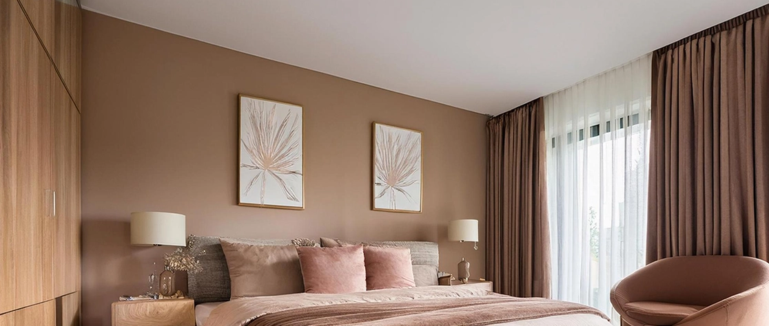
Warm beige on three walls, soft sage on the wall behind the headboard, dusty pink in the soft furnishings. The beige recedes. It reflects warm evening light without adding anything the room then has to manage. The sage on the feature wall has a specific settling quality that beige alone doesn’t achieve. Dusty pink in the textiles, somewhere between pink and brown, brings warmth without the room reading as obviously pink.
Three warm-toned, slightly muted colours. Nothing competes. The room is easy to be in without being boring to look at. JK Maxx shades: Chamois or Vanilla Custard for the base, Herbal Garden or Peaceful for the feature wall, Heather Mist or Rose Ash in the textiles.
Navy on the feature wall behind the bed, warm white on the other three walls and the ceiling, copper in the lamp bases, hardware, and accent elements. Dark timber against navy reads as intentional rather than just dark. The warm white on the other three walls keeps the room from feeling enclosed. This balance is why navy works in a bedroom rather than just making it dark. Copper is the third colour that makes both the navy and the white look intentional. Bronze or warm brass works if copper isn’t available.
This is the combination for a bedroom that should feel serious and considered. Heavy cotton or linen on the bed, dark timber, warm bedside lighting. JK Maxx shades: Stormy Blue or Cove Blue for the feature wall, Navajo White or Paper Moon for the base, copper in fixtures.
Cream on three walls, terracotta on the feature wall, forest green in the plants, curtains, and a textile or two. This palette looks most natural in Indian bedrooms because the materials are familiar. Teak furniture, marble or stone flooring, warm evening light — all of these sit with terracotta and cream without any adjustment required. The forest green comes in through the room rather than onto a wall, which keeps it from feeling like a colour statement.
Wake up to this room in morning light and it looks warm and grounded. That quality is difficult to achieve and easy to disrupt by adding anything cool or pale. JK Maxx shades: Honey Cream or Old Linen for the base, Rustique or Antique Brick for the feature wall, Sherwood Forest or Herbal Garden in textiles.
Warm grey on three walls, dusty violet on the feature wall, antique gold in the lamp bases, mirror frames, and any small decorative elements. The warm grey is genuinely neutral. It gives the eye somewhere to rest after the violet. The dusty violet on the feature wall has enough colour that the room looks like a decision was made. Gold sits between the grey and the violet — it shares warmth with the grey and a certain richness with the violet. Neither colour pushes it away.
The result is the kind of bedroom that reads as curated without being cold. Specific without being themed. JK Maxx shades: Chamois or Smokeytone for the base, Platinum Lilac or Serendippity for the feature wall, antique gold in fixtures.
Pale blue on the feature wall, sandy beige on the other three walls, warm brown through the teak or rosewood furniture and any wooden elements. The blue on the feature wall is cool and creates depth. The sandy beige on the other three walls warms the room enough that the blue doesn’t make it feel cold. The warm brown in the timber doesn’t need to be chosen — it’s already there in most Indian bedrooms. This palette is particularly forgiving because it accepts dark teak furniture, marble flooring, brass fixtures, and most fabric colours without any of them looking wrong.
The bedroom colour combination that photographs best is usually this one. The blue feature wall against beige reads clearly in photographs. Subtler palettes often flatten. JK Maxx shades: April Sky or Lullaby Blue for the feature wall, Morocco Sand or Chamois for the base walls.
One strong wall, one colour doing the heavy lifting. Two strong walls and the room competes with itself rather than settling.
Sixty percent on the base walls, thirty on the feature wall, ten in the furnishings. When all three appear in roughly equal amounts, the room looks like a test rather than a bedroom.
A warm cream base with a cool grey-blue feature wall and no third element connecting them — the two colours look slightly wrong next to each other without anyone being able to say exactly why. The third colour needs to be on the same side as the dominant. Without something warm in the third colour, both walls look slightly wrong next to each other. Not wrong enough to name, just wrong enough to notice.
Pale blue with sandy beige and warm brown timber is the most forgiving for compact rooms. The pale blue on one wall creates depth without making the room feel enclosed. Sandy beige reflects light. The timber is already there. The palette adds character without adding visual weight.
It can. A warm off-white ceiling alongside two wall colours, where the ceiling shade is visibly different from the wall shade, acts as the third colour without requiring a separate paint purchase. This is particularly effective when the two wall colours are both fairly strong and the ceiling provides the resolution between them.