





Walk through an old haveli in Shekhawati and run your hand along the walls. Craftsmen polished that lime plaster, called araish, by hand until it felt almost like cool marble under your fingers. Texture isn’t new here.
Interior texture brings some of that depth back to modern flats, where most walls leave the builder’s hands smooth and a little forgettable. Rooms feel different afterwards. Light starts playing across the walls as the day goes on.
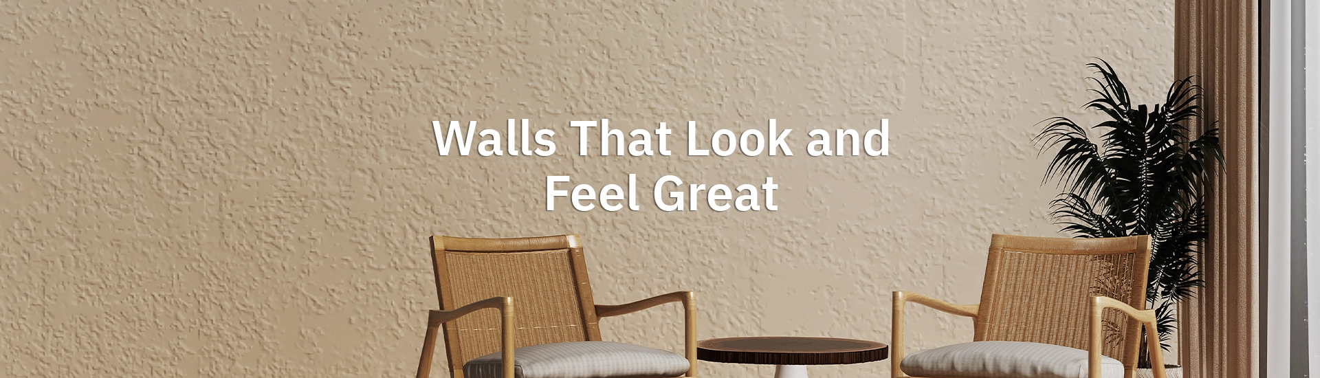
Regular emulsion goes on thin. Interior texture wall paint is thicker, with fine sand or mineral particles mixed in, and a skilled applicator spreads it with a trowel or a comb to leave a raised pattern behind. Your fingers feel the difference.
The tool shapes the result. A trowel leaves soft, cloudy sweeps. Combs pull neat lines. Painters in Jaipur and Lucknow often have their own signature strokes, and two walls done with the same product rarely look identical.
There’s a practical bonus too. Most Indian concrete walls develop fine hairline cracks within a few years, and a textured coat hides those far better than a smooth finish. Uneven plaster disappears as well.
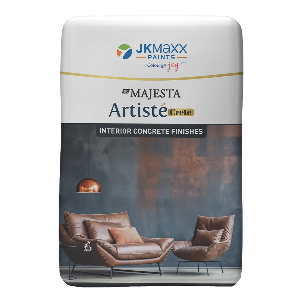
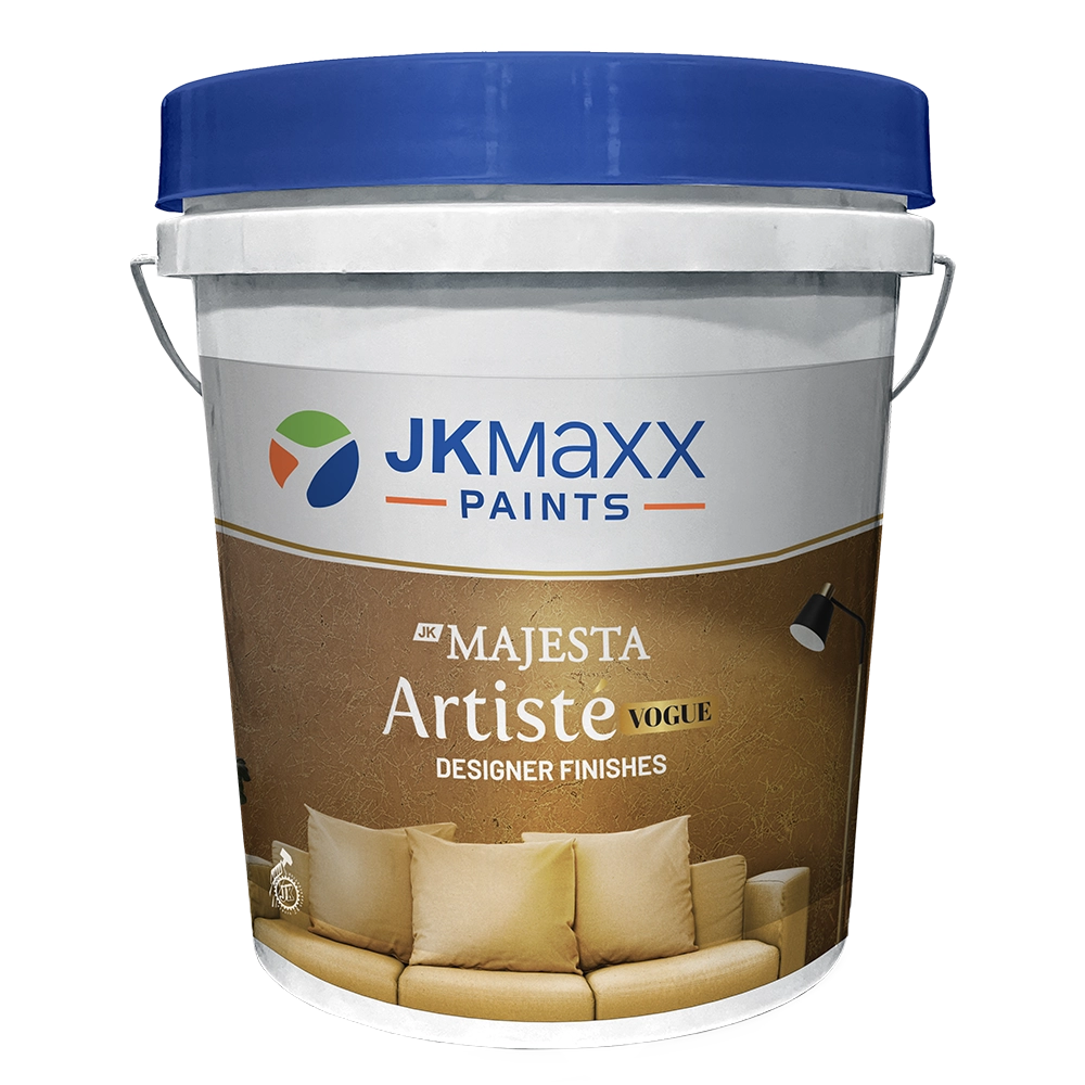
JK Maxx groups its textured finishes for interior walls under the Artisté name, and each one gives the wall a noticeably different feel. Mood decides the pick. Every finish has its own character.
Artisté Sandy Stone has a fine, grainy surface that looks a lot like the weathered sandstone you see on old buildings around Jodhpur. Warm evening light catches it gently. Very forgiving.
Like hand-applied plaster? Artisté Rustic Regular and Rustic Fine give that soft, slightly uneven finish you’d expect in an old farmhouse or a Goa villa. The Fine version is quieter for bedrooms.
Artisté Roma Art is the decorative one. Its sculpted surface suits formal living rooms with high ceilings and a proper statement wall, the kind guests notice the moment they walk in. Use it sparingly.
Cristallo adds a subtle sparkle. On a pale wall behind a dining table, it glints softly under lamplight every evening, and guests usually reach out to touch it. Scratch Jumbo is rougher. Its bold scratched lines suit a rugged, industrial look.
A good interior wall texture design starts with how the room is actually used, from noisy Sunday lunches in the living room to quiet reading before bed. Purpose comes first.
Most people start here, and it’s the right instinct. Texture paint for living room walls works best on the one wall behind the sofa or the TV unit, where the eye lands first when you walk in. Keep the other walls plain.
Picture a Pune apartment with Sandy Stone behind a teak sofa and two warm lamps glowing on either side. After sunset, the grain throws tiny shadows across the wall. Nothing else needs to try.
Bedrooms suit soft, flowing textures. Rustic Fine behind the headboard adds depth without making the room feel busy at night, and pale shades keep everything calm. Skip heavy patterns here.
Try a pooja corner too. A small textured panel behind the mandir, in a warm cream or soft gold, looks like it has always been part of the house. Brass diyas glow against it.
Be careful in these rooms. Deep textures collect grease near the stove, and steam from a daily bath can cause trouble on porous surfaces over time. Smooth, washable paint is usually safer.
Concrete-look walls lead the current wave of modern interior wall texture. A soft grey cement finish suits minimalist flats in Bengaluru and Gurugram, especially with black metal lamps and plain wooden furniture. Industrial but warm.
Limewash-style finishes are also having a moment. They give a cloudy, uneven wash of colour that feels handmade, much like the old araish walls from the opening. Very calming.
Metallic accents come next. A thin shimmer of gold or copper on one textured wall catches light beautifully, though a whole room of it quickly starts looking like a hotel lobby. One wall only.
Colour and texture work together. The right room texture colour decides whether your pattern quietly whispers from the wall or shouts at everyone who walks through the front door.
Pale shades like warm white or soft beige let the texture show through gentle shadows, and they suit small rooms that need to feel open. Deeper colours make every ridge and groove stand out. Terracotta looks dramatic there.
Planning a coloured texture wall? The blue wall textures and grey wall textures pages go deeper, pairing specific JK Maxx shades with the Artisté finishes that suit each colour best.
Check for damp first. Texture applied over a wall with seepage will bubble and flake within a single Mumbai monsoon, taking your money down the drain with it. Sort the leaks out before anything else.
Removing texture is hard work. Most homeowners who tire of a textured wall end up plastering over it, and that costs more than the original job did. Choose a finish you’ll still like in ten years.
Lighting matters as much as the paint itself. A wall washer or a lamp placed close to the textured wall throws the pattern into relief, and a single ceiling tube light flattens it almost completely. Plan both together.
On one wall, it adds depth without crowding the space. Pick a fine texture like Rustic Fine in a pale shade, and keep the other three walls in a smooth matching paint. Heavy patterns suit bigger rooms.
A well-applied texture can easily last many years, often outliving regular paint, as long as the wall behind it stays properly dry through every monsoon. Dust it gently every few months. Avoid scrubbing hard.
Usually you can, once any damp is treated and the loose, flaking paint has been scraped away completely from the old surface. A primer coat helps the texture bond. Ask your applicator first.