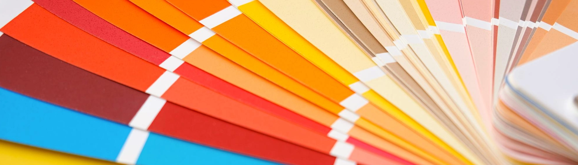

Pink gets avoided in Indian homes more than it should. People associate it with one specific register, sweet, juvenile, overtly feminine, and dismiss the entire colour family on those grounds. The pink family is much wider than that association. Dusty rose, blush, muted coral, terracotta-pink, warm salmon. Most of these look like sophisticated warm neutrals. Nobody walks in and thinks: pink. The colour combination with pink colour that works is almost always muted and greyed. The saturated end is where most pink rooms go wrong.
Before picking combinations, know which pink you’re working with. The pink family splits into three meaningful categories for wall use.
Light Pink Colour Combination Shades: Sugared Peach, Face Powder, Blushing Bride from JK Maxx. These are barely-there pinks that read as warm white in most lights. Good for rooms where you want warmth on the walls without any obvious colour. North-facing rooms, hallways, small bathrooms. The warmth compensates for flat indirect light without adding visual heaviness.
Mid-tone dusty and muted pinks: Heather Mist, Rose Ash, Soft Cashmere from JK Maxx. These are the shades with grey or brown in the base that stop them reading as obviously pink. This is where most of the useful pink combination colour territory sits. On a wall, Heather Mist reads as a warm, slightly pink-toned neutral. It photographs as blush. In person it reads as sophisticated.
Saturated and deep pinks: Peony, Wild Rose, Flo-jo from JK Maxx. These are clearly pink and need careful pairing. On a feature wall with neutrals on the other three sides, they work in bedrooms and dining rooms. Four walls of saturated pink in most room sizes is too much.
The most common pink colour combination for wall use in Indian homes. White skirting, white ceiling, pink walls. The combination is clean and keeps the pink from feeling heavy.
Temperature matching matters here. A warm dusty pink like Heather Mist needs a warm off-white rather than a stark cool white. Match the undertone direction and the room reads as cohesive. Mismatch it and both colours look slightly off.
Pink and warm grey is the colour combination that moves pink out of its stereotype. Warm grey on three walls, dusty rose or muted blush on the feature wall. The grey cools the pink and stops it reading as sweet. The pink stops the grey going flat. This is the pink room colour combination that works in adult bedrooms and living rooms without the room reading as themed or obviously pink. Chamois or Smokeytone from JK Maxx sit well alongside Heather Mist or Rose Ash.
Pink colour combination with pink wall alongside warm teak or rosewood furniture is one of the most natural applications in Indian home interiors. The warmth in both materials finds common ground. Dusty rose or warm blush on the walls with dark teak furniture. The room looks like someone put thought into it. Nothing else is required. Brass fixtures enhance this further.
Pink opposite colour combination, pink with sage or olive green, is the complementary pairing with the most natural quality. Both colours share warm, slightly organic undertones. The combination looks settled rather than designed. Soft Cashmere or Heather Mist from JK Maxx on the walls with sage green in the curtains and natural cane or jute furniture. This pairing works particularly well in bedrooms and verandas.
Soft pink alongside gold and brass is a combination with warmth and richness in equal measure. The warm undertones in dusty pink and the warmth of brass agree with each other. Sweet Blossom or Blushing Bride from JK Maxx. Brass pendant lights, gold-framed mirrors, and warm timber furniture. The room ends up warm and quietly luxurious.
Color combination for dark pink shades like Peony or Wild Rose from JK Maxx needs careful pairing. Deep, saturated pinks are demanding. One feature wall handles the colour well. Four walls of it is usually too much.
Dark pink with deep charcoal creates a dramatic bedroom combination. One wall of Peony behind the headboard, warm charcoal on the other three. Heavy cotton bedlinen, dark timber, warm brass lamps. Striking without being garish.
Dark pink with cream or ivory is the richer, warmer version. Peony or Wild Rose on the feature wall with Vanilla Custard or Paper Moon on the other three. Under warm evening lighting, the combination glows. Particularly effective in dining rooms where the evening light does most of the work.
Pink colour combination for bedroom walls works best in the muted and dusty range. Heather Mist or Rose Ash on all four walls with warm timber furniture, natural linen, and warm-toned lighting in the evening. These shades help the room wind down rather than keeping it active. For a more dramatic bedroom, one wall of Peony or Wild Rose behind the headboard with warm grey or cream on the other three.
Pink in a living room works two ways. One wall in a mid-tone dusty rose, or very pale pink across all four walls. A mid-tone dusty rose on one wall behind the sofa. The room gets warmth and personality. It doesn’t read as pink. Pair with warm wood furniture and brass or copper accents. The room reads as warm. Nobody categorises it as a pink living room.
Sugared Peach or Face Powder from JK Maxx in a kitchen. Under the warm artificial light most Indian kitchens run on in the evenings, these light pink colour combination shades glow rather than go flat. On the practical side: pale pink hides light cooking marks better than stark white. It also holds up better than cream under warm kitchen lighting.
White and warm off-white give the cleanest result. Warm grey alongside pink is the more contemporary version. Natural teak or rosewood furniture doesnt need any other colour decisions. The warm wood and the pink do the work. Sage green creates an earthy, natural pairing. Gold and brass add warmth and richness.
Light pink colour combination shades like Sugared Peach or Blushing Bride work well in north-facing rooms. Pink adds warmth that north-facingrooms donsnt get from the light itself. A warm dusty pink in a north-facing bedroom stops the room
from feeling cold and flat.
Eggshell or satin for living rooms and hallways. These rooms need to be wipeable. Matte for bedrooms where the flat finish suits the softness of pink. Semi-gloss for kitchens and bathrooms.

