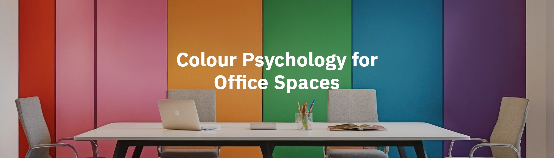
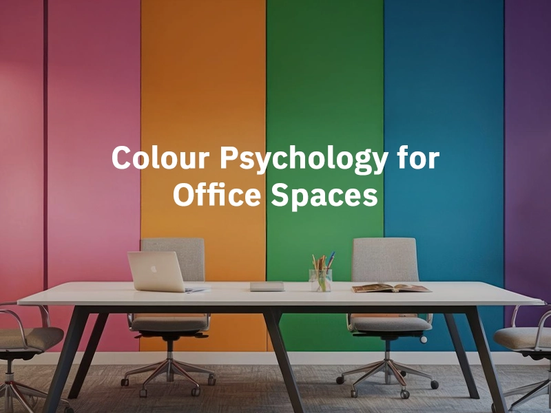
As you brainstorm the best ideas for your business or schedule a meeting with a client, don’t you envision your workspace to look bright, beautiful and productive? At JK Maxx Paint, we deliver the best office colors. Today, we will study the most popular colour combination for office walls. Let us check out the office interior colour palette available on our official website.
Did you know that, as per colour psychology, blue, sage, white, black and beige are best suited for influencing everything from productivity to team spirit? Colour psychology is a terminology that analyses how different colours affect human emotions, mood and behaviour. For office interiors, the goal is to evoke positivity and creativity while fostering employee well-being and productivity.
Below are a few shades that have a significant impact on an employee’s ability to focus and enhance productivity:
Pro tip: Choose 3-tier palettes including primary, secondary and accent shades for a balanced look and feel. Combine with natural elements and lighting such as soft spots, desk lamps or indirect LEDs.
In this era, it’s all about mood-enhancing, productivity-boosting and emotionally layered shades.
Quiet work nooks
Mentally grounding and calming shades are perfect for this zone. Paint colors such as sage green, olive green, ivory and taupe support focus and creativity.
CEO/ founder office
Opt for black and charcoal for authority, power and depth. Best combined with brass, neutrals and blush hues.
Lounge/ creative corners
Promote culturally-rich storytelling with warm shades such as muted green, burnt clay, ivory and terracotta.
Consulting zones/ writing desks
Create strategic editorial strategy within a peaceful and emotionally intelligent environment. Consider shades such as blues and greens for encouraging deep work. For podcast setups and content creation, blush and ivory shades are ideal.
At JK Maxx Paint, we offer high-shine, glossy and matte paints for interior and exterior walls. Choose from increasingly popular office shades that promote a natural yet premium finish. The best office interior color palette is chosen based on colour psychology. Explore the best office room colors at our official website.
The best shades for the office interior colour palette are green, yellow, dusty rose, neutrals and accent shades.
For premium and luxury spaces, it is recommended to use bold shades such as charcoal, purple and light grey.
To promote productivity and creativity, it is recommended to use powder blue and olive green for a home office.
For a creative space to brainstorm content or branding, you can use feminine hues or neutral colour palette. On the other hand, for photography and fashion studios, implement metallics and purple.
Office colours play an important role in boosting productivity, employee well-being, creativity and calmness. For instance, yellow inspires creativity while blue evokes focus and positivity.
As per colour psychology, every room should be painted in different shades. Lounge and creative rooms should be coloured charcoal and metallics while using cinnamon and blush tones for executive rooms.
Yes. Office owners can make use of strategic colour combination for office walls such as soft blues and light green, beige and white and brown and yellow.
For emotionally resonant and brand storytelling, use colours such as sage green, warm white and beige in matte ceramics. On the other hand, for boutique studios and cultural rooms, use rich and luxurious shades like olive green, orange and lilac.
Some of the modern trends in office wall colours involve bursts of bold hues mixed with neutral shades. Also, integrating textured walls in earthy tones for nature-inspired interiors.
For an overall aesthetic vibe, opt for earthy luxe, muted jewel tones, soft minimalism, blackened neutrals and blue and green hues.