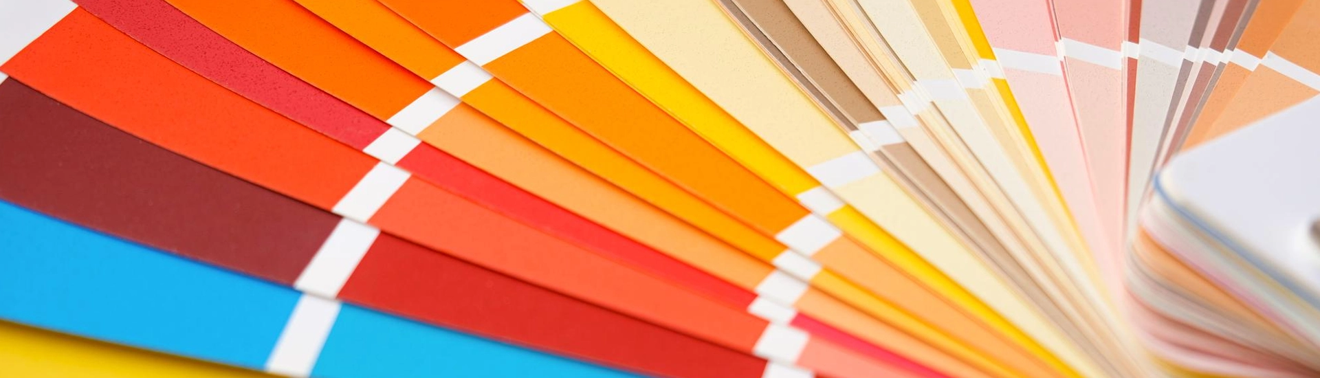
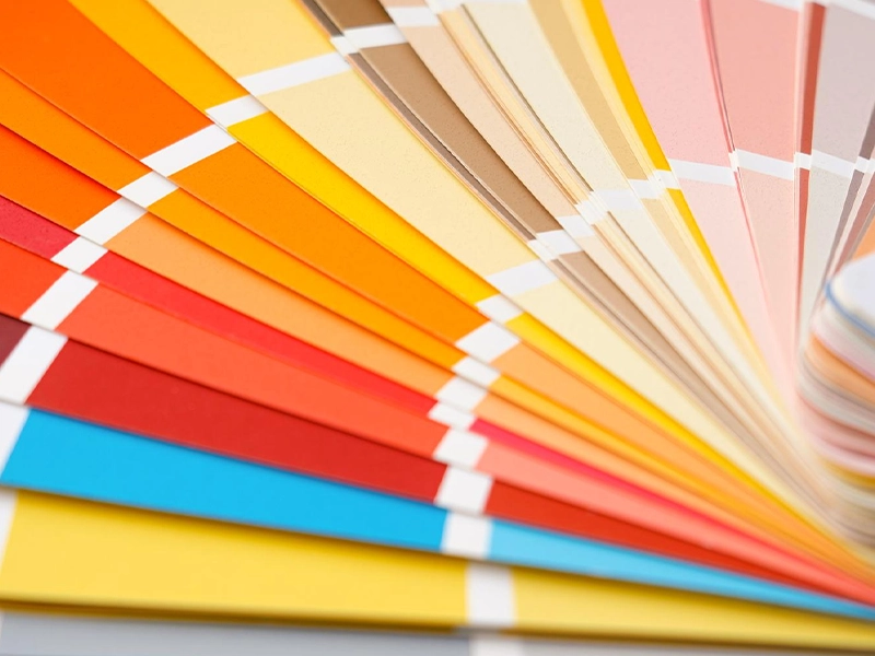
Honestly, just hearing the word orange makes most people panic. You immediately think of cheap burger joints or those awful plastic pumpkin decorations. It feels way too loud and completely risky.
But a properly planned orange colour combination is literally a designer secret weapon. Forget the shiny neon shades. Once you look at the baked, muddy tones, the colour completely transforms. It stops yelling at you. It just makes the room feel unbelievably warm and anchored, which is something basic beige and flat white just cannot do. You do not need to avoid it. You just need to control it.
If you want to stop playing it safe, here is how you actually make it look good.
Before we even look at sofas and curtains, you need to pick a lane. This colour has two totally different moods, and they act very differently once they dry on your plaster.
Try looking at pale clay, muted apricot, or soft peach. They do wonders when you are stuck in a small flat that barely gets any natural daylight. A pale peach basically acts exactly like a neutral backdrop. Once the afternoon sun hits that wall, the whole space just glows. It feels incredibly fresh and bright, but it brings way more character than a boring cream wall. You get a space that feels open and happy without any overwhelming energy.
Here is where the real drama comes in. Got a big room or a space you want to feel super moody and intimate? Those deep, baked earth shades look incredibly premium. Most of us have tons of heavy teak and mango wood furniture sitting around the house, and these darker paints highlight that beautiful wood grain flawlessly instead of clashing with it. A rich terracotta or a muddy ochre gives your home an instant upgrade that feels very grounded and earthy.
You pair it with the wrong thing, and it gets ugly fast. Here are the colour pairings that actually work in real life.
Notice that is not pure white. If you put a pure, stark white next to a warm wall, the contrast is way too harsh. It looks jarring and slightly cheap. A buttery cream or a very gentle off white is truly the best combination with orange colour when you want maximum coziness and zero stress. The cream visually softens everything, making the entire space feel insanely welcoming.
Orange is inherently warm. Grey is inherently cold. Mix them together, and they balance out perfectly. A burnt clay accent wall sitting behind a charcoal grey sofa instantly kills any loud energy. You get a grounded, polished look instead of something that feels like an overdecorated carnival. It is the smartest way to use bold paint without making the room feel wild.
Combining navy with rust always looks good, though you need to watch your proportions. You cannot use equal amounts of both, or your eyes will cross. One colour has to be the boss. Try painting the main walls a dark navy, then dropping in an armchair or curtains in a rich rust shade. Or do the opposite. Put terracotta on the focus wall, then throw down a big navy floor rug to balance things out.
You cannot treat every single room the same way. What works behind your television is going to give you a massive headache in the bathroom.
Most people think this shade has absolutely zero place in a bedroom. Wrong. You simply need to turn the brightness down to zero. The best bedroom orange colour combination completely relies on muddy, dusty tones instead of anything bright. Try painting just the wall behind your headboard in a warm terracotta. Add plain white or oatmeal bedding, a couple of brass bedside lamps, and a woven cane chair in the corner. Texture is what actually makes this work. Once you bring in rough linen fabrics, woven cane, and unpolished timber, the space settles down into a quiet retreat.
This is where you can actually push the boundaries. An earthy tone behind your television unit, or as a backdrop to a neutral sofa, makes the whole space feel intentionally designed. Just remember to break up the colour block. Do not leave a massive wall completely bare. Break it up with a large framed print, a couple of simple timber shelves, or a leafy indoor plant. Dark green foliage against a warm wall works remarkably well every time.
From a practical standpoint, these tones hide turmeric and spice splatters beautifully. Visually, they perfectly complement brass plates, copper pots, and wooden chopping boards. Just make sure you pair those walls with very neutral cabinets. Soft beige or light grey works perfectly so the room never feels like the inside of a hot oven.
Once you buy the paint tins, make sure you avoid these easy slip ups before wrapping up the job.
You are working with a colour that naturally demands attention, so you just need to give it a very quiet supporting cast. Grab a muddy and earthy shade, surround it with warm neutrals and natural timber, fix your lighting, and you will understand why designers love this colour.
Keep the ceiling plain. Carrying a rich shade all the way overhead makes the room feel low and boxy. Stick with cream or a faint off white overhead so the ceiling feels higher while the walls carry the color.
Yes, if you keep it strategic. Coating every single wall of a
tiny room in dark rust will close the space in. Paint just one wall to add depth, or use a faint peach everywhere to keep the light moving.
Always lean into warm metals. Brass, gold, and copper look absolutely stunning against earthy walls. They enhance the warmth. Silver or chrome tends to clash and can make the whole setup feel disconnected and cold.

