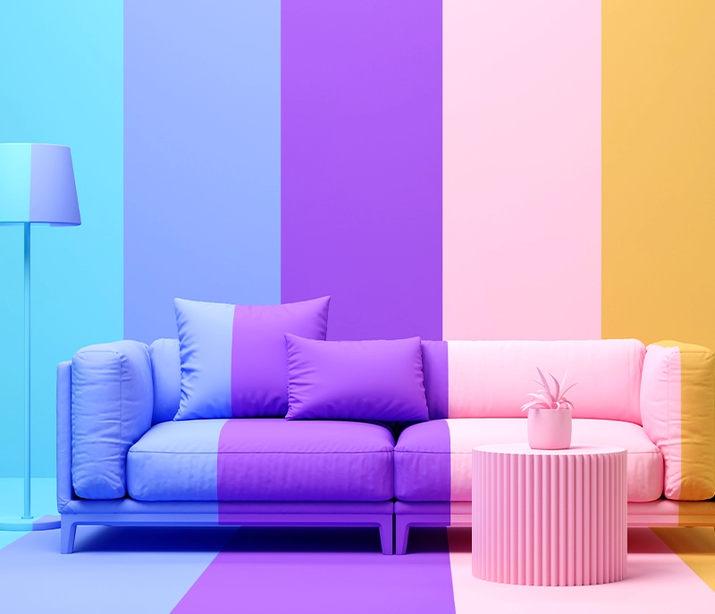
Colour psychology refers to the study of how colours affect human behaviour and emotions. Why do individuals feel more relaxed in green rooms and why do weightlifters perform their best in blue gyms? These questions have been explored by researchers for many years. The meanings of different colours may vary across cultures, and even in Western societies, the significance of colours has evolved over time. Nonetheless, researchers have generally found certain colour associations to hold true.
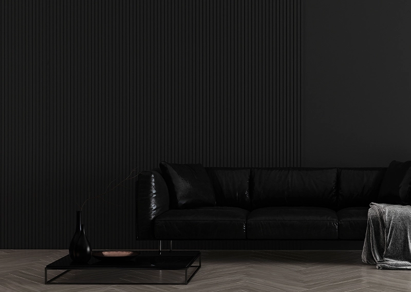
The colour black is associated with authority and power, and is a popular choice in fashion due to its slimming effect and timeless appeal. However, black can also imply submission, as evidenced by its use in religious garments worn by priests to symbolize submission to God. Some fashion experts suggest that a woman wearing black may be perceived as submissive to men. Moreover, black outfits may dominate and create a sense of distance or malevolence. Thus, it is rarely used in interior or exterior design.
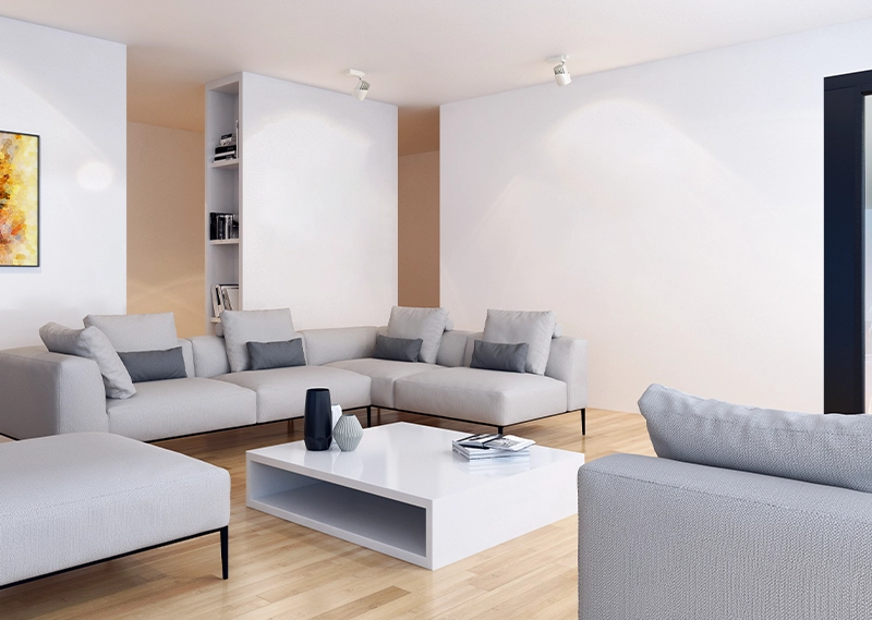
In various cultures, white is associated with different symbolic meanings. Brides wear white to signify their purity and innocence, while doctors and nurses wear white to convey sterility. White is also a popular summer colour as it reflects light. Its neutrality and versatility make it a popular choice in both fashion and interior decorating. However, white requires more maintenance than other colours as it easily shows dirt and stains.
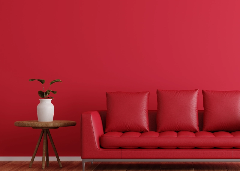
In the realm of colour psychology, red is considered the most emotionally intense colour. It has the power to stimulate a faster heartbeat and breathing rate. Furthermore, it is commonly associated with love and passion. However, it is important to note that wearing red clothing can make the wearer appear heavier, and using it excessively in negotiations or confrontations may not yield favourable results due to its extreme nature. Additionally, red cars are often targeted by thieves. In interior decorating, red is typically used as an accent colour. Designers advise that any red furniture pieces should be of the highest quality, as they are sure to attract attention.
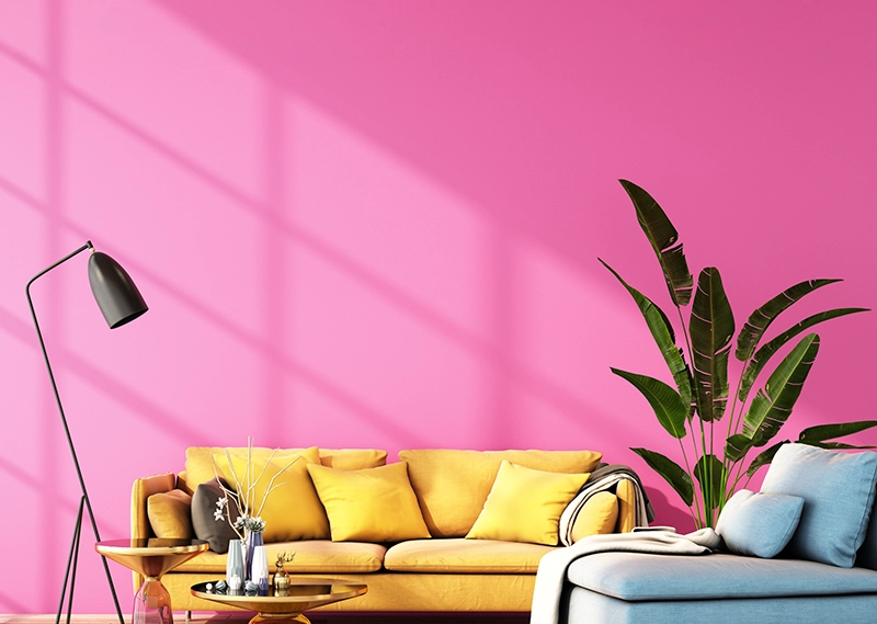
Pink, known as the most romantic colour, has a calming effect. Interestingly, some sports teams paint the locker rooms of opposing teams a bright shade of pink with the intention of sapping their opponents’ energy.
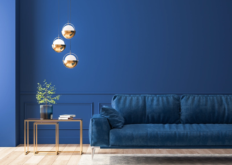
Blue, the colour of the sky and the ocean, is a highly favoured hue, evoking a sense of serenity and calmness that is opposite to the stimulating effects of red. It stimulates the production of calming chemicals in the body, making it a preferred colour for bedrooms. In the world of fashion, blue signifies loyalty, making it a recommended choice for job interviews. Moreover, studies indicate that people tend to be more productive in blue environments, with weightlifters demonstrating greater strength in blue-hued gyms.
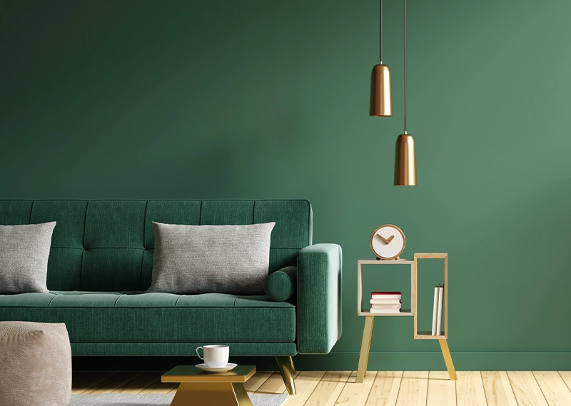
Green, a colour that evokes nature, has become the preferred choice for interior decorating. As the easiest colour for the eye to process, it even aids in improving vision. This calming and refreshing hue is commonly used in the entertainment industry, where guests sit in “green rooms” to relax before going on air. Hospitals also utilize green in their facilities as it has a soothing effect on patients. Interestingly, brides in the Middle Ages wore green to represent fertility. When it comes to fashion, dark green conveys a sense of masculinity, conservatism, and wealth.
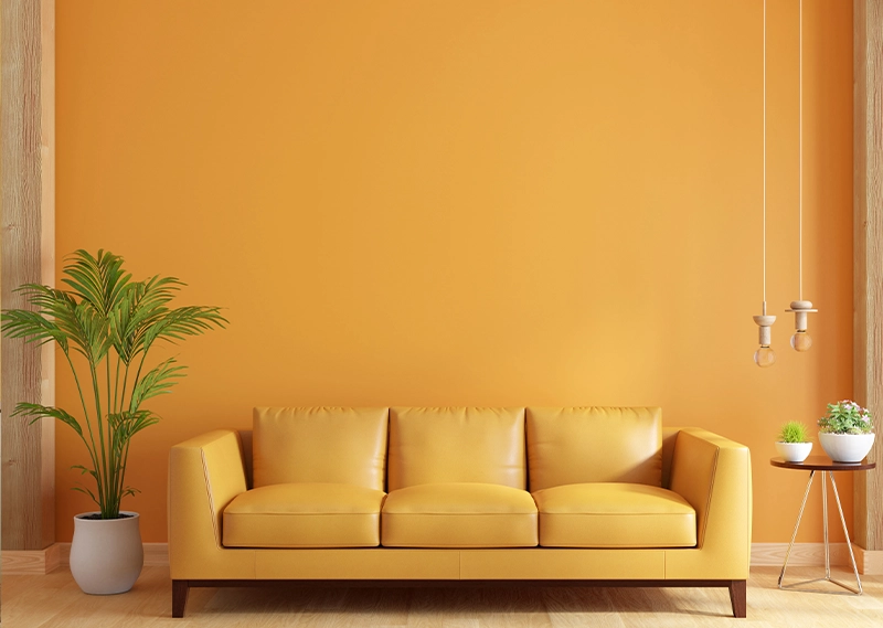
Yellow is a colour that radiates warmth and happiness, waking up the room like the rising sun. It conveys hope and positivity, and bright shades of yellow can create a sense of excitement and energy. Yellow also has the ability to lighten and brighten any space, providing a cozy and welcoming ambiance. From vibrant sunflower yellow to subtle buttery hues, yellow is a popular choice for children’s and family rooms.
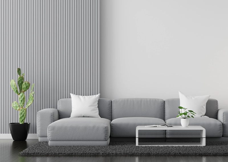
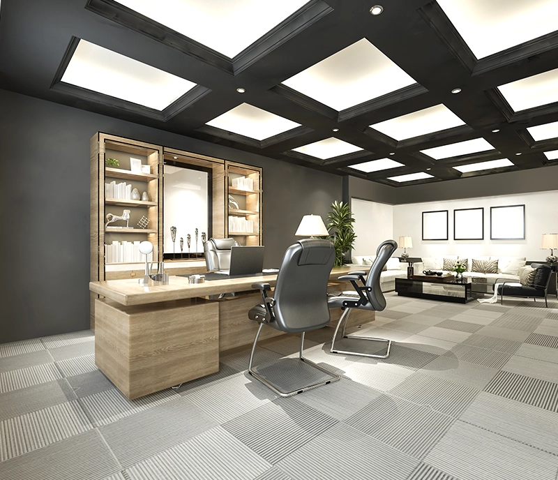
Grey is a cool and refined colour that exudes a sense of formality and sophistication. It is often employed in settings that require a dignified and polished ambiance, such as formal workspaces and offices. Light grey is a particularly suitable choice in these environments, as it imbues the space with a sense of understated elegance.
Brown is a colour that exudes a natural charm, reminiscent of the earth, wood, and stone. With its nourishing energy and rich, earthy tones, it is a popular choice that evokes thoughts of delectable chocolate, gourmet coffee, and exquisite woodwork. When paired with crisp white, warm camels, golden yellows, fern greens, or barn reds, it creates a warm and inviting living space. On the other hand, light browns provide a cool and relaxed ambiance, perfect for unwinding after a long day. Brown is a versatile colour that can add depth and richness to any interior design scheme.
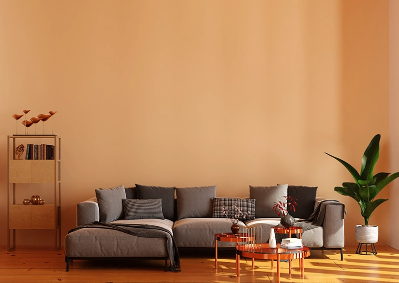
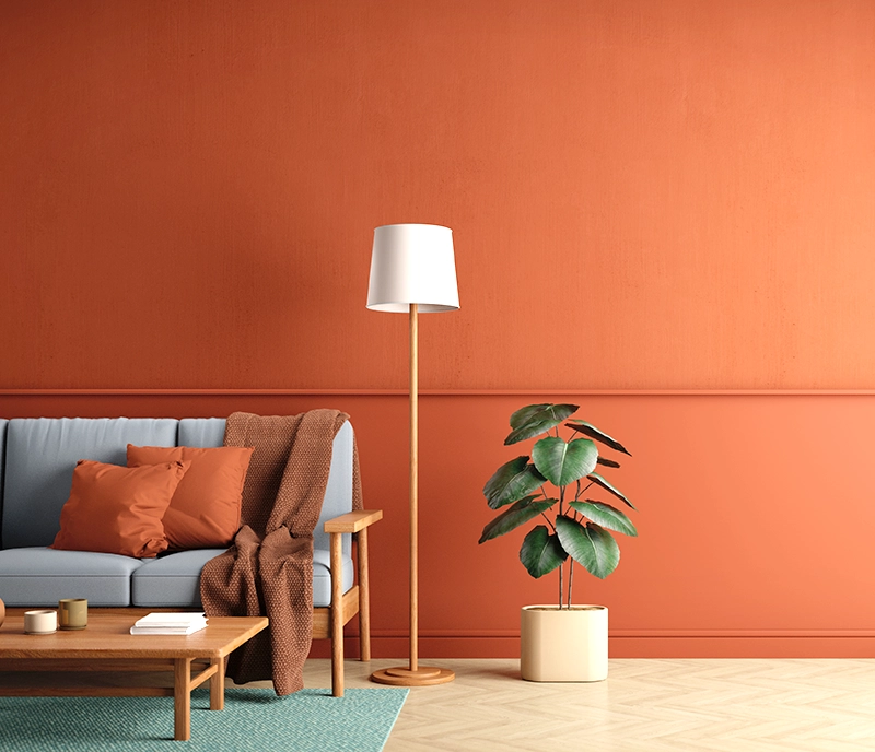
In the living room and foyer, warm hues such as reds, yellows, oranges, and earth tones like brown and beige are often favoured as they promote conversation. These colours create an atmosphere that inspires people to gather, sit and engage in meaningful discussion, evoking a sense of warmth and connection.
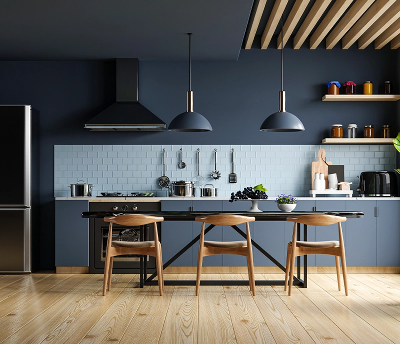
According to colour consultants, recreating the colour scheme from your childhood kitchen in your current kitchen may evoke fond memories. For instance, if you have cherished memories of a blue-and-white kitchen, incorporating these colours may be ideal for you and your family. If you don’t have a specific colour scheme in mind, warm colours like reds and yellows are often recommended for the kitchen, living room, and foyer as they promote conversation and create a welcoming atmosphere. However, individuals who are conscious of their weight should be cautious about using the colour red in the kitchen, as it may subconsciously stimulate appetite.
In a formal dining room, red decor can be an excellent choice due to its stimulating nature. Red not only encourages conversation but also arouses the appetite of your guests. Moreover, the colour red is often associated with passion, intensity, and confidence, which may lead people to assume that you are a skilled cook if your dining room is adorned in this colour.
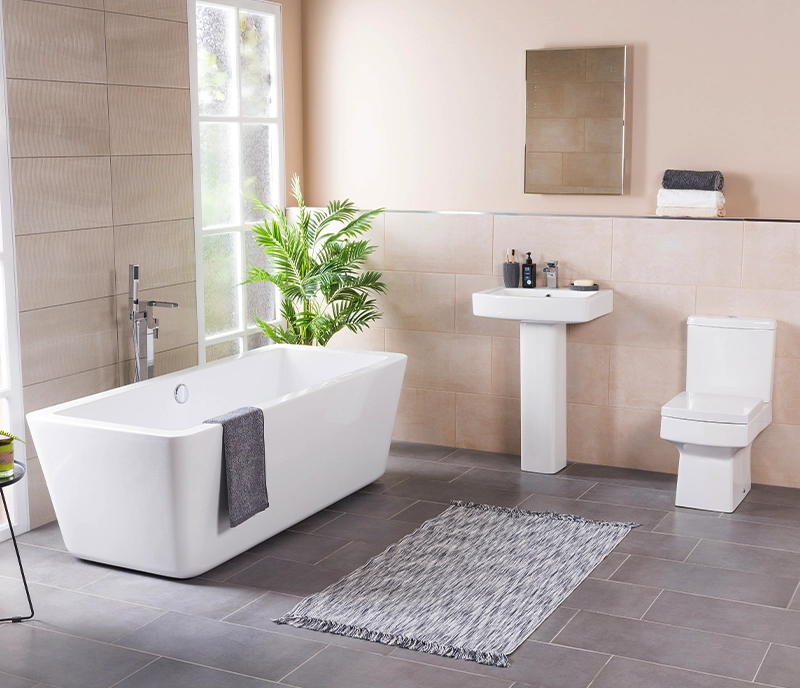
In contemporary times, the bathroom is not merely a place for hygiene but also a sanctuary for relaxation and revitalization. While whites and warm colours have traditionally been favoured for their association with cleanliness and purity, blues, greens, and turquoises have gained popularity for their ability to convey a sense of freshness, serenity, and tranquillity, thus offering a serene and revitalizing experience.
At JK Maxx Paint, we provide high-performing home paint colour for interior walls. Your home is more than a space, it reflects your personality, emotions and little moments of joy. Choosing the best paint for home walls acts as a reflection of your purpose and beliefs in life. Elevate your everyday experiences and uplift your mood as and when you enter each room of your house. We believe in painting with a purpose to create a home-like feeling that truly resonates with your inner being.
Every home asks for warm and welcoming energy. Choose amongst pastel, neutral and grounding shades for your interior house walls. Now let us check out the best paint for home walls:
1. Understand the mood
When looking for the best colour for house, delve into what story you want to express. Best exterior house colors and interior emulsions reflect on your personality, emotions and function. Thereby, each room is painted with different shades and colour combos.
2. Use colour psychology
The home paint colour psychology is based on the mood, emotion and behaviour of the home buyer. The right combination helps enhance sleep, boost productivity and create a cozy and inviting atmosphere.
3. Pair with furniture & décor items
Every piece of furniture and décor item requires a well-paired wall colour. The most popular choice is to keep things neutral and calm. However, you can also opt for a subtle hint of glam and sophistication for added style and aesthetic.
4. Test with natural light
Natural and artificial lighting can significantly affect the interior spaces. While warm lighting might make colours look more yellow, cool lighting can amplify the undertones.
5. Match with texture and finishing
Textured finishes are the perfect way to add finesse into any setting. You can also opt for metallic accents and ombre walls with soft gradients and an aesthetic vibe.
JK Maxx Paint offers best paint colours for home interior and exterior walls. Our wide range of dustproof, washable, low VOC shades are designed for long-lasting coverage and enduring protection against tough weather conditions.
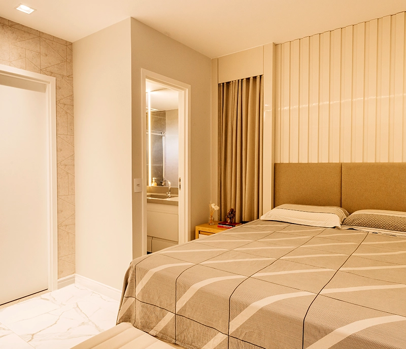
Transform Your Bedroom Into A Sanctuary — JK Maxx Paint
At JK Maxx Paint, we present to you the best paint for home and interior spaces. When looking for paint options for the bedroom, homeowners or buyers only trust high-end, expert colors. The best bedroom colours are ones that resonate with your personality and enhance your emotional well-being. Our high-performing room wall painting products bring passion, positivity and peace to indoor spaces.
Your bedroom is a sacred space, more like your personal escape. As you come back home, your bedroom becomes a place to unwind, rest and recharge. With the best colors for bedroom, you can transform your bedroom into the cosiest corner of your home.
✔️ Low VOC, breathable paints: Each stroke of our non-toxic paints promises safety, sustainability and high standards. Our paint collection is safe for home and safe for the planet.
✔️ Durable & dust-resistant finishes: JK Maxx Paints transform bedroom wall painting into a clean, neat activity. Crafted to resist dust and wear, leaving your indoor walls looking fresh and classic for the long term.
✔️ Budget-friendly wall colors: Get luxury on a budget by giving your guest room a glow-up. Choose from premium tones and affordable classics and turn your dream bedroom into a reality.
✔️ Textured finish: Its super smooth and sheen finish provides the perfect finish. The stain-repellent and washable paints ensure that little mishaps never leave a mark.
Neutral Paint Shades: If you’re looking for a soft, aesthetic touch for your dream bedroom, opt for paint colors such as beige, ivory, soft taupe and creamy white. Perfect for a vintage, clean and regal look.
Classic Paint Shades: Paint colors like white, mocha and grey never go out of trend. Homeowners aiming for a rich, grounded and premium look should opt for timeless paint colors. The classic hues result in a dust-resistant, no-stain and luxurious finish.
Pastel Paint Shades: Our low VOC paints are ideal for creating a soothing, cheerful and calming environment. Add a touch of softness to your bedroom with paint colors such as powder blue, blush peach and lavender. Perfect for modern homes looking for a feel-good vibe.
Minimal & Timeless Aesthetics: At JK Maxx Paints, we offer the best colour for rooms with high-performance coverage, an easy-to-maintain finish and long-term durability.
Romantic Hues: If you’re aiming for clean lines and uncluttered vibes, add emotional warmth to your bedroom with romantic bedroom shades. Explore JK Maxx Paint colors such as dusty rose, mauve and wine hues for a soft, loving ambiance.
Modern Interiors: For those who prefer bold and edgy tones, bedroom wall painting helps reach goals. Consider shades such as charcoal, deep teal and dark blue. Suitable for contemporary, urban homes, JK Maxx Paint presents low-maintenance sophistication.
Here’s how bedroom colours can affect your mood:
Impacts sleep quality
Bedroom wall painting impacts sleep quality, as it creates a calming environment. Opt for soft shades such as blue, pink, mint green and lilac for a relaxed vibe.
Affects emotional memory
Peach, ivory, and pinks create an environment of warmth, comfort, and love. Make your bedroom a laidback yet positive space with high-performing, best paint for home by JK Maxx Paint.
Uplifts mood & vibe
Uplift your vibration with beautiful colours for home such as ivory, yellows, and blush rose for a positive atmosphere. Create a serene foundation for any room and help unwind by keeping visual noise low and energy calm.
Reflects your personality
Create a feeling of balance by reducing stress with shades such as sage, olive grey, and mocha brown. Make your bedroom come to life, no matter your budget.
Whether you’re looking for the best bedroom colors for kids’ room, master bedroom or boho-style bedroom, JK Maxx Paints has the perfect shades for you. Ideal for homeowners, interior designers, builders and real estate consultants, our paint range helps you set the mood effortlessly. Home buyers can opt for interior emulsions that are soft sheen, low-VOC formulas that are environmental-friendly and stylish. JK Maxx Paints offer premium finish, support better sleep and positive energy. The dust-resistant, stain-resistant and washable paints keep your walls fresh and vibrant with minimal maintenance.
Colour psychology engineers the spaces based on mood, emotion and functionality. It can uplift spirits and evoke a sense of tranquility and calm. For instance, red stimulates boldness and passion while blue shades tend to be cooler and refreshing.
While choosing paint colours for home is a personal choice, we recommend looking for different and varied colours in each space for personality and variety.
Yes. JK Maxx Paint offers low-VOC/ low odour, anti-fungal and washable paints offering a rich sheen, colour durability and superior coverage.
Visit JK Maxx Paint’s official website and open the ‘find a colour’ tab. Choose the desired colour palette and select the right shade for your house.
When looking for the best paint for home, consider the colour trends and textures. Most recent colour trends include timeless warm neutrals, earthy shades for matte or glossy walls and deeper hues like brown and burgundy for geometrical patterns and textured finishes.
Best bedroom colors include neutral and bright shades such as ivory, beige, mocha, pink and lavender.
To choose the best colour for a room, visit our official website, go to ‘find a color’ section and pick the right shades as your preferences or moodboard.
The latest trends in bedroom wall designs include textured walls, geometric patterns and pastel hues. Home owners can also opt for a combination of all three. Each trend adds a unique look and premium aesthetic to the room.
JK Maxx Paints offers depth and character to bedrooms. Home buyers can choose from a wide range of joy, durable & dustproof paint for your home. Our motto “khushiyo ke rang” promises joy to your home space with a colourful, bright and washable range of premium wall finishes.
Transform your plain bedroom wall with bedroom colors from JK Maxx Paints. You can experiment with soft pastel shades, bold accents, textured finishes, or a two-tone effect. The premium quality of JK Maxx’s premium paint colors will add warmth, freshness and uniqueness to your bedroom.