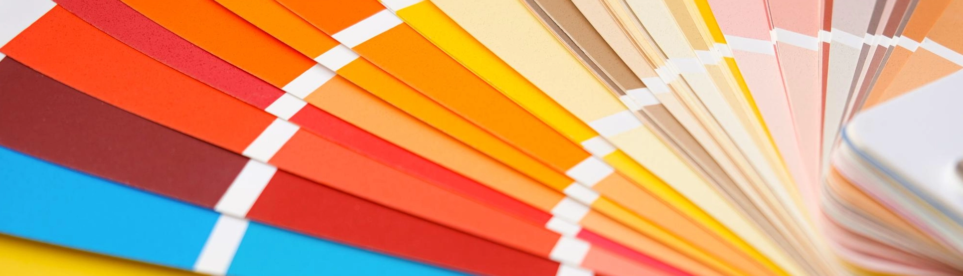

Walk into almost any Indian home in the evening and you’ll probably find a brass diya burning somewhere, with a string of marigolds drying by the door. Nobody planned it. Our homes just lean warm.
A warm colour palette builds on that instinct, but it needs a little thought in a country where summer afternoons regularly cross 40°C. Some warm walls feel cosy. Others feel like a heatwave.
Red and orange are obvious. Yellow too. But brown counts as well, and so does that creamy off-white your grandmother probably had on every wall of the house for thirty years. It’s all about the undertone.
There’s a quick test you can do right at the paint shop counter with nothing more than a sheet of plain printer paper. Put the chip on it. Yellowish or peachy means warm.
Warm colours also seem to move towards you. In a compact city flat, a deep orange wall can make the room feel a little smaller and more closed in than the same room painted pale grey. Use that carefully.
Pale warm shades are the easiest to live with. Good for bedrooms. Buttercup Mist or Sugared Peach from JK Maxx bring a soft glow to large walls without making the room feel hot.
Mid-depth warm tones carry more personality. Keep them to one wall. Mustard and Autumn Flame from JK Maxx work beautifully on a single feature wall, especially behind a sofa or dining table where the eye naturally lands.
Deep warm shades are for drama. Santa Fe Red or Acorn from JK Maxx look rich at night under warm lamps, but they can feel heavy in small rooms with limited daylight. Plan around your windows.
A good warm tone colour palette usually mixes all of this across a home, with pale shades on most walls and deeper ones used where you want attention. Balance matters most.
Not every warm room needs bold colour. Warm neutral colors like Honey Cream or Egg Custard from JK Maxx give walls a gentle, sunny base that sits comfortably beside wooden furniture and marble floors. Easy to live with.
Brown is having a moment again, and honestly, it’s about time after years of everyone painting their flats the same safe beige. Try Caramel Kiss. It’s richer than beige but still quiet enough for a big living room wall.
Anyone who’s lived through a Delhi winter with the windows open knows how quickly a white wall turns greyish from all the fine dust drifting in. Warm neutrals hide it. You’ll wipe the walls a lot less.
Terracotta and cream is the classic warm color combination for Indian homes. Hard to get wrong. Rustique on one wall with Egg Custard on the others feels earthy and settled, almost like a courtyard in the afternoon sun.
Mustard with deep brown looks bolder. A Mustard feature wall behind a walnut bookshelf feels warm and a little retro, in the best sense of that word. Very 70s.
Warm and cool together? Surprisingly good. Picture peach walls with one teal armchair in the corner, and suddenly the peach looks peachier and the whole room feels more awake than it did before the chair arrived.
Living rooms suit warm colour schemes more than any other space, since warm shades tend to make people linger and talk. Try one terracotta or mustard wall. Keep the rest neutral.
Kitchens handle energetic warm tones well. Use a satin finish. A pale yellow or soft peach wall keeps the room bright and cheerful during morning cooking, and it hides turmeric splashes better than white.
Bedrooms need the gentler end. Muted peach or honey cream on the walls settles the room nicely by bedtime. Bright orange or red close to the bed tends to keep the mind busy long after the lights go out. Go soft here.
Dining rooms are where deep warm colours shine. Santa Fe Red behind the table with a warm pendant light looks inviting at dinner time, and the colour makes food look good too. A small bonus.
Nobody warns you about this part. Paint a west-facing wall in fiery orange, and by 3pm in a Nagpur May the room just feels hotter, even if the AC is running exactly the same as yesterday. Colour plays tricks.
So think about direction before choosing depth. Keep deep oranges and reds on north or east walls, and choose pale warm shades for walls that bake in afternoon sun. Your AC will thank you.
Monsoon changes things again. Grey skies from July to September can make pale warm shades look dull, so a slightly richer warm tone on the main wall keeps the room cheerful through those weeks. Worth considering.
Check the bulb before you blame the paint. A warm 2700K or 3000K LED makes yellow walls look golden after dark and gives terracotta a deeper, richer look than it had at lunchtime. Cool white tubes? They flatten everything.
Test every shade at home before buying the full quantity. Paint a large patch on the actual wall and check it at breakfast, then again after dark with your regular lights on. Only then decide.
Deep warm shades can, because they seem to move towards you and close in the space around you slightly. Pale warm colours like Buttercup Mist do the opposite. Choose depth by room size.
Soft, muted shades such as Sugared Peach or Honey Cream from JK Maxx feel restful without turning cold at night. Bright red or orange near the bed can feel too energising. Stay gentle.
Mixing usually looks better. Keep your walls and big furniture on the warm side, then throw in a couple of cool touches like a sage cushion or a blue ceramic vase on the shelf. Don’t overdo it.