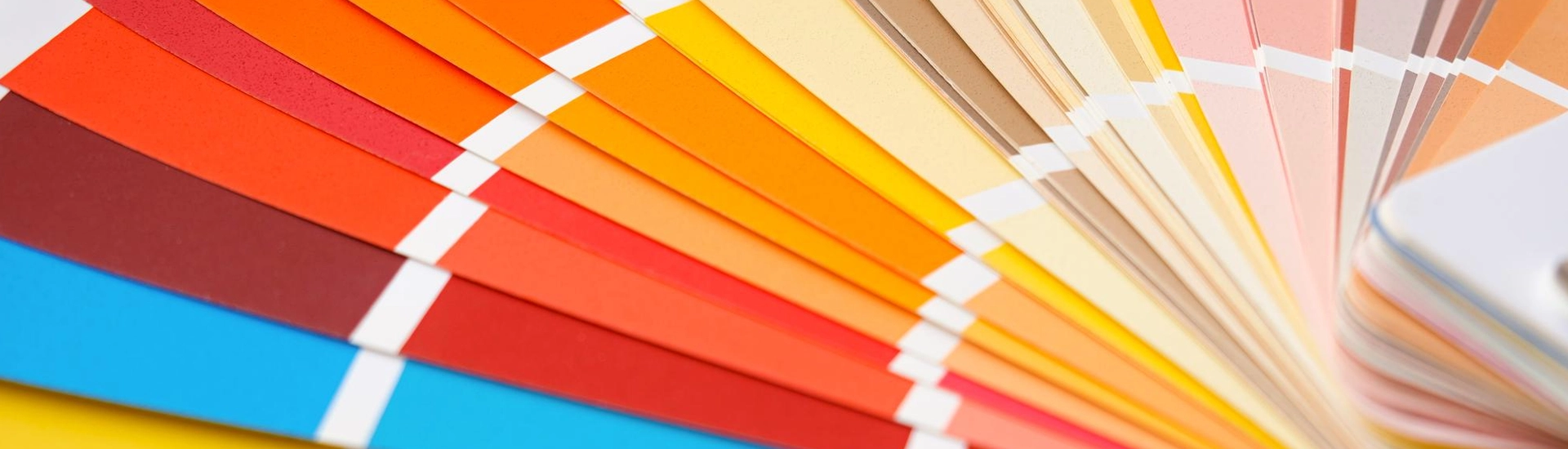

Maybe you want a space that feels calm but still packs some actual character. You flip through a paint brochure and a really nice teal catches your eye. It looks like a tropical holiday on paper. But buying blue green wall paint is terrifying. Mess this up and your lounge will instantly look like a dirty aquarium or some forgotten washroom from thirty years ago.
These shades are incredibly frustrating to work with simply because they change their look constantly. In the morning sun, it might look like a crisp ocean blue. By the time evening rolls around, the shadows pull out heavy green tones.
But when you actually nail the exact right shade, it is pure magic. It gives your house an incredibly custom and expensive atmosphere. Here is the unfiltered guide to making these shades work in your house without completely losing your mind.
Before you grab a roller, you have to pick a lane. This colour spectrum is massive, and you need to match the shade to the size and lighting of your specific room.
If your flat is tiny or you are working with a hallway that gets zero natural sunlight, look at a light blue green wall paint. Think about the colour of sea glass or very pale aqua. These shades reflect whatever little light you have and push the walls outward visually. But you must pair this pale colour with heavy textures. Bring in some chunky woven rugs and raw timber furniture. If you do not add texture, a pale aqua room will quickly start looking like a nursery.
This is where interior designers absolutely love to play. Deep peacock, rich teal, and dark marine colours bring massive drama. Got a massive bedroom that needs to feel secluded and quiet? Those darker tones look incredibly expensive on the walls. Deep teal ends up being the perfect backdrop for warm teak and rosewood. The dark paint makes that warm wood grain pop beautifully. It feels very heritage, very grounded, and extremely sophisticated.
Covering all four walls might feel like way too much commitment, so just split the difference. Try putting a really heavy teal on the lower half of the wall and leaving the top section a soft cream. It anchors the furniture perfectly without turning the room into a dungeon. You still get that punch of colour, but the ceiling stays out of the way.
Finding the right blue green interior paint is only half the battle. You have to surround it with the right supporting cast.
This is the ultimate secret weapon. Blue and green are naturally cool colours. If you surround them with glass tables and grey sofas, the room will feel freezing and clinical. Walnut, teak, and mango wood inject the warmth you need. The golden and red tones naturally hiding in the timber balance out the cool walls instantly.
Push a mustard yellow chair right up against a dark teal wall and the contrast is absolutely brilliant. The yellow cuts straight through the heavy darkness of the paint and creates a stunning focal point. Skip the yellow if it feels too loud and grab some baked clay tones instead. Rust cushions or terracotta tiles bring a really nice earthy warmth into the space.
People think this is a terrible idea until they see it done right. You do not want a bright bubblegum pink. You want a muddy and muted blush. Bring the pink in through heavy linen curtains or a large textured rug. It softens the heavy walls and makes the entire space look highly curated.
Every room demands something different. What looks brilliant in your lounge will probably ruin your kitchen.
A mid tone teal is your absolute safest bet in the main lounge. It acts as a surprisingly good neutral backdrop for your television unit and sofas. It sits quietly in the background without overwhelming you, but it still has way more life than a boring grey wall.
Keep it dark and moody in the bedroom. A rich marine or dark peacock feels like a massive visual hug. Just make sure you have plenty of warm brass bedside lamps to balance the dark walls. Putting crisp white sheets against a dark teal wall is a classic hotel trick that always looks expensive.
This is where pale aqua truly shines. It gives you that instant coastal resort vibe. Hang a warm brass mirror and install some open timber shelves. That rough texture stops the bathroom from feeling like a sterile public swimming pool.
Do not ruin the entire project at the finish line by making these incredibly common mistakes.
Yes, provided you pick a smart shade. Very
pale aqua bounces daylight around the room and stops things from feeling claustrophobic. Dark
teal will close a tiny room in unless you only use it on a single feature wall behind your sofa or
bed to create some depth.
Always choose brass, gold, or copper. Warm metals
look absolutely stunning against cool walls. Silver and chrome tend to look a bit too clinical and
cold, which leaves the room feeling disconnected.
Painting literally everything the same colour is a
huge deal right now. Slapping the exact same tone on your walls, trims, and ceiling completely
hides the corners of the room. Your eyes get tricked into thinking the space is way taller. If you
picked a pale colour, absolutely do this and watch the magic happen. But if you went with a dark
teal, keep the ceiling cream so you do not feel trapped in a tiny box.

