

Cool colours, exemplified by blue, green, and purple (violet), imbue a serene, relaxed ambiance, reminiscent of natural elements such as water and grass. These tones create a tranquil setting, inducing a calming effect.
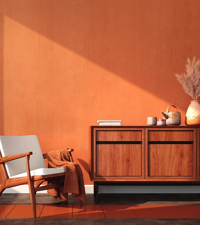
In the realm of colour theory, red, orange, and yellow are classified as warm colours, evoking the fiery energy of the sun. In addition, these hues are known to create a sense of visual proximity, appearing to draw the observer closer to the subject at hand. Consequently, these warm colours can be utilized to imbue a room with a cozy, inviting atmosphere when deployed in the context of interior design.
In the realm of aesthetics, harmony is a desirable quality that captures the attention of the viewer, engendering a profound sense of balance and order in the visual experience. Conversely, a lack of harmony can lead to disinterest, boredom, and even chaos, thereby causing detachment from the subject at hand. The use of colour harmony is a potent tool that not only elicits visual interest but also fosters a profound sense of order and coherence.
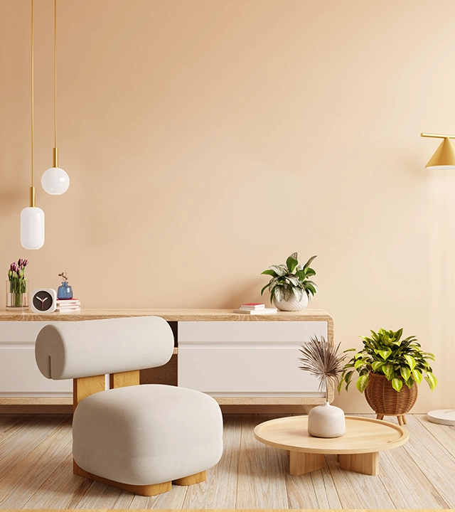
Neutral colours, as they relate to painting and interior design, encompass shades without colour. Neutrals serve a dual purpose in decor, either in a subdued, monochromatic design or as a background for bolder accents. Colours such as beige, ivory, taupe, black, grey, and white appear colourless but often feature underlying tones, such as gold, pink, or grey, which must be considered when selecting hues or paint.
What mood do you want your room to hold? Should it feel calm and airy? Warm and comforting? Or maybe you’re just wondering why that beige you loved in-store suddenly looks… pink on your wall?
Choosing paint colours isn’t as easy as picking a favourite from a shade card. With so many tones, trends, and opinions out there, it’s easy to feel stuck. You think you’ve found “the one”, and then you test it on the wall, and it’s nothing like you imagined.
But here’s the good news: there’s no strict formula to follow. You don’t need to play it safe, and you don’t need to follow what’s trending. The colours you pick should feel right, not just look good in a catalogue. A thoughtful palette can make your home feel like you. It brings structure to the chaos, and still leaves space to play.
Whether you’re setting up your first flat, reworking your living room, or just craving a change that doesn’t involve a full renovation, paint is a good place to begin. Because colour isn’t just visual; it sets the tone, changes how a room feels, and can completely shift your energy.
Here’s how to find the right palette, one that works with your space, reflects your personality, and actually feels like home.
If calm and quiet is your vibe, cool shades are your friend. Think soft blue, green, or purple, they’re inspired by nature and help open up a room visually. Perfect for bedrooms, reading nooks, or work-from-home corners where you want things to feel light and peaceful. Add soft whites for that breezy, minimal feel, or mix with greys to keep it grounded but still soothing.
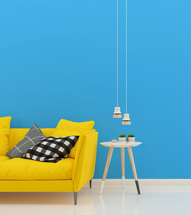
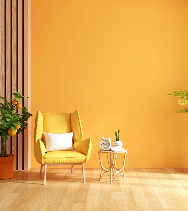
Want a space that feels cosy and welcoming? Warm shades like red, yellow, and orange can bring in energy and a sense of closeness, making them great for living rooms, dining areas, or anywhere people come together. They instantly lift the mood and make a space feel more alive. To balance the warmth, use a white colour palette for contrast or a touch of black to ground it.
Beige, ivory, and grey such subtle colours that may not shout for attention, but they create a steady base for everything else. Neutrals help balance bold shades and are easy to update over time. They’re ideal when you want something timeless and low-maintenance. Pair them with accents from a white or black colour palette depending on the look you want: clean, crisp, or classic.
Great combinations don’t happen by chance. Ever thought of mixing yellow, orange, and a deep blue for something vibrant yet balanced? The right mix creates flow, brings personality, and just feels right the moment you see it. Good colour harmony helps the whole room work together, nothing feels out of place, and every shade has a role to play. It’s the difference between random colours and a space that feels well thought out.
Every space has its own rhythm, and colour is what sets it in motion. Whether you’re drawn to misty blues, leafy greens, or sun-kissed tones, starting with the right palette helps everything else fall into place. So pick shades that feel like you, play around with combinations, and trust the process. Your space doesn’t need to look like anyone else’s, it just needs to feel like home.
Choosing paint colours feels fun, until the shade you loved looks off on your wall. Here’s what usually goes wrong (and how to fix it):
A colour might look great in-store but feel very different once it’s on your wall. Always watch it in your actual space.
Natural daylight, white tube lights, and warm bulbs all shift how colours appear. Test shades in different light settings.
Bright tones are fun but can be overpowering. Use them for accents or a feature wall, and pair with calming neutrals.
Your wall colour should complement your sofa, bed, and flooring, not clash with them.
Whites can have hidden hints of pink, blue or yellow. Compare similar shades side by side before finalising.
Quick Tip: Start neutral, add colour through cushions or one wall, it’s easier to change later.
Go with what feels right. The best palette is the one that suits your space and your style. There’s no rigid rulebook, just your space, your instinct, and colours that speak to you. And when it comes to finding those shades? JK Maxx Paints has the right solution. From cool and calming to warm and bold, our range works across every kind of moodboard. Our finishes are designed to bring out the richness of each hue, making colour mixing easy and smooth, especially when you’re working with a thoughtfully chosen colour mixing palette.
Undertones are the subtle colours hiding beneath the main shade. You might look at two whites and think they’re the same, until you hold them side by side. That’s when you notice one has a bit of warmth, maybe a soft pink or yellow touch, while the other feels cooler, with hints of blue or grey. This becomes important when you’re working with neutrals or combining different colour families. If you don’t consider undertones, you might end up with walls and furnishings that technically match, but somehow still clash.
Think of it as your cheat sheet for building a room that feels put together. A colour mixing palette is a group of colours, usually a primary shade, a couple of neutrals, and one or two accent colours that work well together. It helps you create flow across the space without things feeling too matchy or too random. Say you’ve got a dusty pink sofa, olive green cushions, and creamy white walls. That’s a colour mixing palette in action: soft, balanced, and full of character.
Yes, and it’s one of the biggest reasons paint doesn’t always turn out the way you imagined. The same colour can shift a lot depending on the light. A beige might look perfectly neutral in the shop, but once it’s on your wall, it may lean peachy under warm bulbs or go slightly grey in natural daylight. That’s why it’s smart to swatch your colours and observe them morning to night, with all types of lighting on. It’s the best way to avoid a surprise once the paint’s dried.
Absolutely, and it often makes the space feel more layered. The key is balance. If you’ve got a warm mustard wall, bring in something cool, like a dusty blue rug or seafoam cushions, to balance the temperature. Then tie it all together with a neutral base. A white colour palette keeps it airy, while touches of black or deep grey can ground it nicely. It’s not about contrast for the sake of it, but more about creating depth that feels intentional.
That depends. If your furniture is already there, start with it and build your colour scheme around the pieces you’ve got. Look for colours that complement, not necessarily match, your sofa, tables, or cabinets. If you’re designing from scratch, choose a paint colour that sets the mood, and let your furnishings follow. Either way, connection is key. You don’t need a perfect match, just tones that get along.